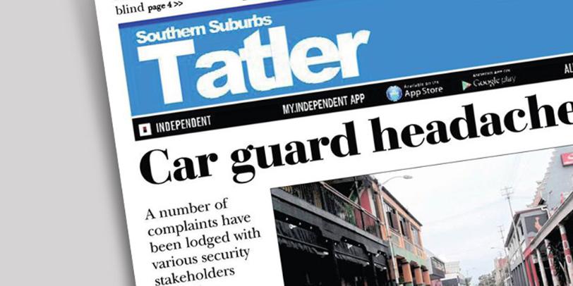
Tatler, T atler or just Tat?

I have the highest of regard for local newspapers and for those who create them. I know firsthand the work that goes into each issue. If I ever travel somewhere new, a local newspaper is a great way to get an insight into the lives of the people who live there. They are often papers for locals put together by locals and neighbourhoods benefit greatly from their work. Just brilliant! I write this blog out of positivity so it's with the greatest of respect that I write this post.
Ive been living in the Southern Suburbs of Cape Town for many years now and each time our local paper the 'Southern Suburbs Tatler' arrives in our postbox, I get a reminder of just how much it's masthead bothers me! I am sorry, but it just does! Its set in a San Serif and the 'atler' part of the word has been tracked back to an inch of its life, with each letter touching. I actually dont' mind this but what I do mind is the capital 'T' at the beginning of the word and how it sits independently with a huge, and I mean seriously huge space before the rest of the word. I read it T alter!!! Its such a shame that this bothers me as much as it does. I really don't want it too as it's generally a very good read and a well produced paper but I just can't get past it!
Being a practicing commercial designer myself, I understand completely that our work is constantly in a state of critique. My goodness, I'm not saying that I am perfect here! on the contrary, Ive made my fair share of boo boo's and each time Ive learnt something new from the experience. Of course, I realise fully that a local newspaper will have some serious budget restraints but the brand name is it's DNA and sets a precedence to whats inside. A change to this masthead doesn't have to cost a lot of money and as a supporter of the local press, for me this change could make a huge difference. Love and peace to all!


Comments
Post a Comment