Posts

Showing posts with the label Colour

50 + Designers, Agencies, Books, Websites, Blogs and Conferences!

Image
At the end of 2016, as I draw closer to my final week with CTTC Design, I had been handing over as much information as I could to my then design team, to which I extend you all on this list now. I know that many have often laughed at me being such a design groupie… I promise that it comes from my love of what I do! To this end, before I left, I had decided to note down a few of the things that have helped to bring great joy, learning and passion to my design life over the years, and now wondered if you would also be interested to see what I had written.  Its really a “for what it’s worth” list of designers, books, websites and blogs. I do hope that it is of some interest to you, and also that it maybe even helps to bring some creative passion and inspiration to your lives… I also don’t mind if it’s banished to the 'read later' part of your blog readers - you know the one I mean... AKA the bin ;-). Below is what I had sent to the team at  CTTC Design, a  couple of day...
Taco Bell Logo Refresh

Image
Many years ago, I travelled across the USA. It was an incredible experience that I will always cherish. Business has kept me traveling back and I have since designed branding and packaging for some of the countries largest retailers. One of my memories of my time traveling the US was the bright branding used by the many of fast food companies. Competition in the US was so much greater than that of the UK, where at the time I had travelled from. Now living in Cape Town many of the chains are starting to appear here. We recently saw the arrival of Dunk'in Donuts. I am not necessarily, someone that frequents fast food establishments, but the branding is of interest to me. I love how some are stooped in the history of 1950's America. I also love how they have subtly changed over the years. To read through some of my older posts, there are stories on the evolution of Burger King and Ihop. Taco Bell is another of the brands that I did not got to see, growing up in the UK. Back in 200...

Lukie's Farmhouse

Image
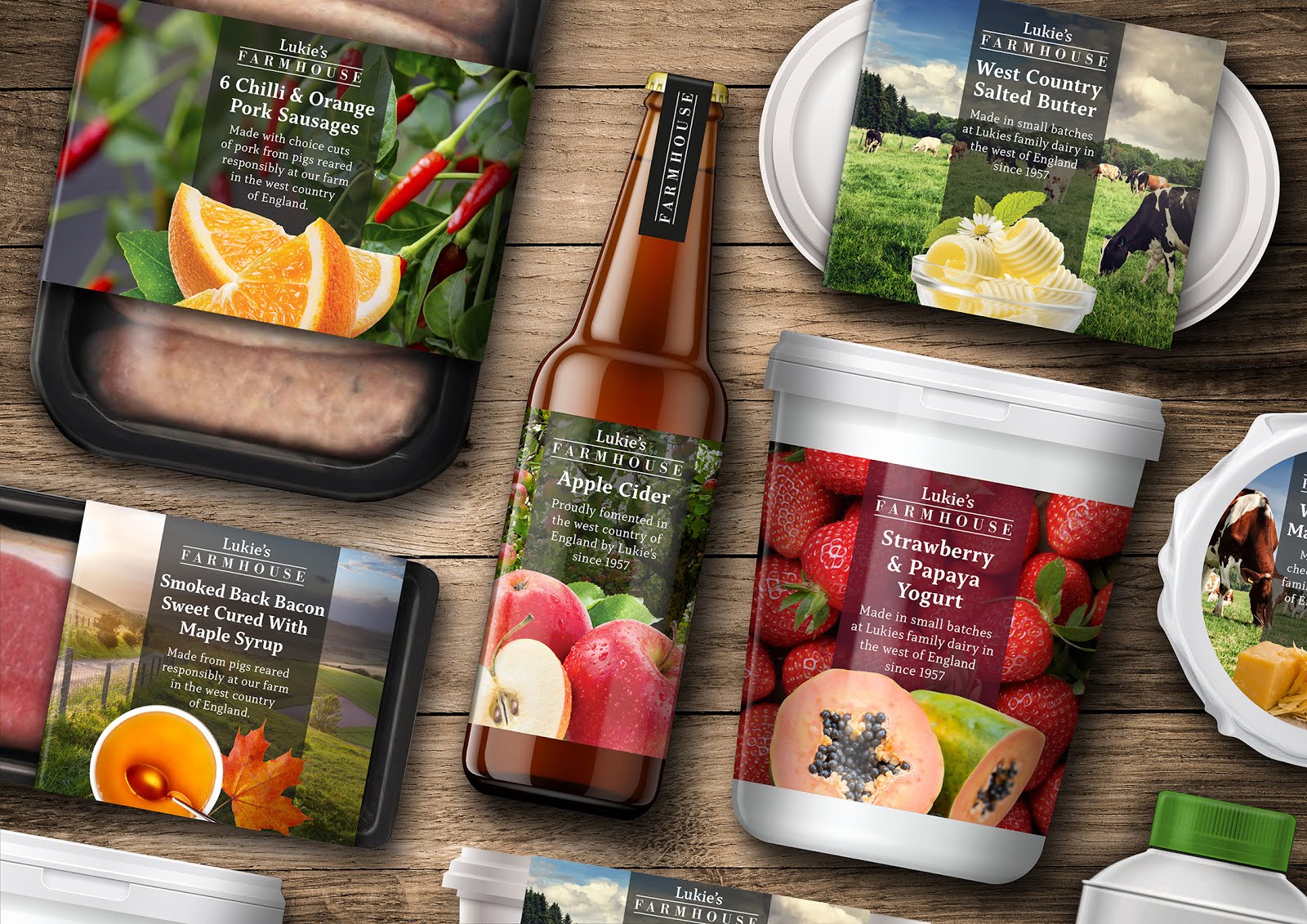
Lukie’s Farmhouse / The Story I can clearly remember the first time that I ever tried authentic west country cider with strong cheddar cheese. I was with my father and it was from a place that he called Lukie’s, in the mendip region. On a recent trip back to the UK (I currently live in Cape Town), I could clearly see that Lukie’s no longer existed… that’s even if it was called Lukie’s in the first place as my dad seems remembers it as Luke’s, without the ‘i’. A Link Back To My Past To conceive an idea for a range of food packaging and to breathe life back into the Lukie’s name as a brand, seemed like a great concept for a project and a lovely link back to my own personal past, being brought up close to the area in Bristol. My addition of the word Farmhouse helps to reinforce the ranges tone. A working title was also Homemade, but ultimately, I felt that Farmhouse just felt right for the range and worked so well visually in Bodoni, contained between two lines, with the Lukie’s word mar...

Quantas Brand Update

Image
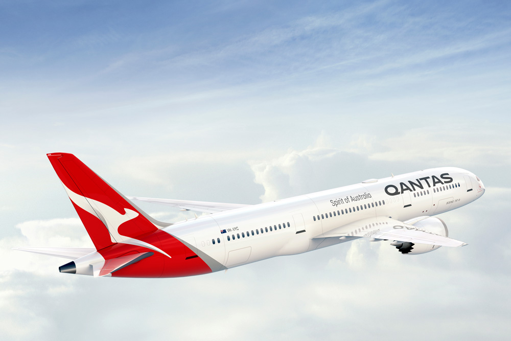
Australia’s largest airline has introduced a new logo and livery, designed in partnership with Quantas consultant Marc Newson and Australian branding agency Houston group. In a press release, Quantas write: The change is only the fifth time the red-and-white image on the tail of Qantas aircraft has been updated since it was first introduced in 1944. The last update was in 2007 to coincide with the introduction of the Airbus A380 to the national carrier’s fleet. Marc Newson, who has helped design Qantas’ lounges, the A380 cabin and the iconic Skybed, said: “Aircraft tails are fantastic canvas to work on and the Qantas logo is one of the most recognisable in the world. This re-design aims to retain the fundamental essence of the flying kangaroo but also move the brand forward. “This new brand is more streamlined and the shading behind the kangaroo gives a better sense of movement and depth.   On the Houston Group Project Page: The key opportunity for us was in contemporisin...

The History of the Shell Logo

Image
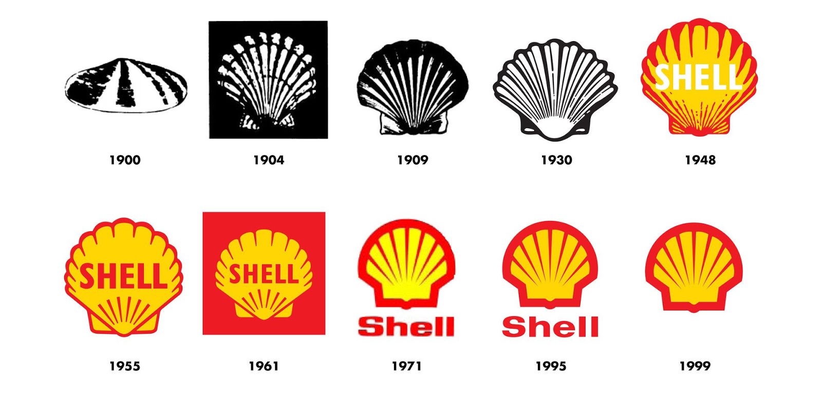
This is the history of one of the worlds most recognised brands.  For more than 100 years the Shell pecten emblem and distinctive red and yellow colours have visualised the Shell brand and promoted the company's products and services all over the world. The Shell logo has changed considerably since it's inception in 1900, yet you can still apreciate it's iconic form, whether viewing the original logo or in its current form. I always remember Michael Wolff recounting his work on a redesign of the Shell logo, whilst running his agency, Wolff Olins. Wolff chose to simply warm up the colours. As he says, sometimes its what you don't change, that can be as important as what you do. That couldn't be more true than with the the iconic symbol of the red and yellow shell icon. I stumbled across this brief history of the brand on the company website  and thought it was well worth a read. The word Shell first appeared in 1891, as the trademark for kerosene shipped to the Far E...

New Logo For MasterCard Designed By Pentagram

Image
The new logo for Mastercard, designed by Pentagram, has been raising eyebrows online and seems to be dividing the design industry on whether people are in favour or not. I for one am a huge fan of the new design! I love how Pentagram have looked back at the heritage of the logo and brought back original elements, yet balanced it perfectly to create a brand-mark that is ultimately very modern and uncluttered. This is most evident within the choice of a clean and modern type style that has been employed, all in lower case and now moved below the symbol for the first time. This logo is a success for me in the same way that the updated Google logo was last year. Great branding is about creating a simple iconic message. Look at Apple, Nike or what the red cross means to us all. These are forms at their simplest that instantly connect with us and this is why the pared down and modenised re-working is so successful for me. What are your thoughts on the revised, paired down design? Below is th...

Sainsbury's Design Studio 1962-1977

Image
I am an avid collector of design books and on a recent trip back to the UK, I stumbled across a fantastic book containing a veritable gold mine of vintage Sainsbury’s packaging, chronicling the years 1962 to 1977. The books forward tells the story of the author, Jonny Trunk and his search for a particular 1970 Sainsbury’s pack design for cornflakes that he had memories of from his childhood. On calling the retailers head office, he discovers that there’s a huge archive of pristine Sainsbury’s own label packaging dating back from the 1960’s and onwards. An ideal subject for a book! There is also an essay from Emily King, which gives an insight into the relationship between the company director, forward thinking JD Sainsbury and the visionary designer Peter Dixon who founded the Sainsbury’s in house creative studio and spearheaded it’s unique pack designs.       Also of note is the important role that the company played in society. Britain was going through a period of soci...

My Copy of Graphis Diagrams

Image
In 1974 Walter Herdeg edited issue 165 of Graphis Diagrams, a square hardback book showing the scientific side of graphic design. It contains beautifully illustrated, full colour diagrams of abstract data and theres also some lovely multi layered maps that use transparent papers. The cover is a fantastic example of the modernist Swiss style of type and design. It really is a thing of beauty, an iconic classic and I once had a copy, or should I say, I may still have a copy... Somewhere! It wasn't that I forgot I had it, but instead that I was recently reminded when I turned to page 46 of Steven Heller and Veronique Vienne's fantastic book '100 Ideas That Changed Graphic Design', and there it was in all it's glory, featuring in the chapter 'The Square Format! I am not completely sure of how this book came into my life. My father was always great at picking up a bargain and may of bought it second hand for his son. My family always supported my love of everything c...

Bass - Trademark No1

Image
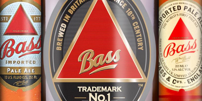
In my Classic Brands series, I am going to feature interesting facts and a brief history to some of the world most iconic branding and packaging designs. I couldn't think of a better place to begin the series than with the worlds very first registered Trade Mark. A great conversational piece at any dinner party is the question, ‘what was the world’s first brand identity?’ The answer is the instantly identifiable red-triangle of the Bass Pale Ale logo. This distinctive identity was registered under the United Kingdoms 1875 Trade Mark act. Due to the fact that the act actually came into effect on 1st January 1876, an employee of Bass queued outside the registrar's office for the whole of the New Years Eve night to ensure that they were the very first in line to register the trademark the following day. Thanks to the efforts of that Bass employee, Ratcliff & Gretton Ltd received the first two registrations, the Bass Red Triangle for their pale ale and the Bass Red Diamond for ...

Annie Leibovitz & Jim Carrey - Vanity Fair White Cover Design

Image
This is one of those cover designs that every now and then shoots into my head. I worked as an art editor for a publishing company for many years and I know firsthand the importance of a cover design to really scream out from the shelf. With so many magazines vying for real-estate why would anyone buy yours! In a sea of red and luminous colours this November 1999 cover for Vanity Fair resonated from the shelves by doing the exact opposite and being minimal.   The cover shot of actor Jim Carrey has him against a white background. The composition of the actor is from the waist up, he is unclothed but completely covered in white make-up, the only area of colour being the actors eyes and lips. The image was taken by Annie Leibovitz and the design compliments this stunning photography. In fact the design is so restrained in its use of colour that the cover lines are only visible by the use of a light grey shadow. For me a truly memorable cover.

The Big Issue 231

Image
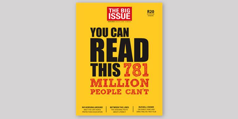
As I pulled up to the traffic lights, I was completely taken when I saw this eye catching cover to a recent edition of the Big Issue. I enjoyed the cover for so many reasons. Firstly the use of typography and colour to instantly connect with the audience is fantastic! The bright colours and the way that the designer has skilfully used hierarchy within the typesetting really captures you! I also like how the size of the logo header is kept to a minimum to give more gravatas to the strong and poignant headline copy that pulls you in even further, 'You can read this, 781 million people can't.' The article inside is also brilliant! Please click here and support the Big Issue and the incredible work that they do!

Coca Cola's Innovation In Design

Image
Back in 2011 I attended a presentation by David Butler, Coca-Cola's VP of innovation and he outlined how the company were using revolutionary systems to operate on a global scale. This included designing their vending machines so that they could be easily modified to accommodate the vast stable of brands owned by the company and interchangeable languages for use throughout the world. David's presentation was an inspiration in both business agility and creating modular systems. Coca-Cola have continued to innovate! A little earlier this year Coke announced that they had created the world's first plastic bottle made entirely from plant-based material. Coke partnered with Varent for the project who are creating chemicals and fuels using renewable resources to replace crude oil. With the plant bottle project Varent used BioForming technology that converts starches and sugars found in plants to produce the plastic. Incredibly, the plant bottle feels just like a normal PET plas...

Why Pink & Blue?

Image
I recently became a dad to a wonderful, amazing little boy and he is definitely the most loved new addition to my design life. Whilst my wife was still pregnant, we decided that we did not want to know the babies sex before the birth and loved the idea of it being a surprise. This however was met with some shock and surprise from a good many of our friends who just couldn't believe that we wouldn't want to know this in advance. How could we possibly prepare if we didn't know what colour to decorate the babies room or buy them clothes? I suddenly started to ask myself why! Who decided that pink was a feminine colour and blue masculine. The marketeers? The branding experts? More so, why is there actually a need for a gender based distinction? At this point my curiosity kicked in and I suddenly wanted some answers. After some research, I found images of babies clothing from the 18th century, showing both girls and boys in white frilly dress style outfits. Many articles claim t...

Colour Wars

Image
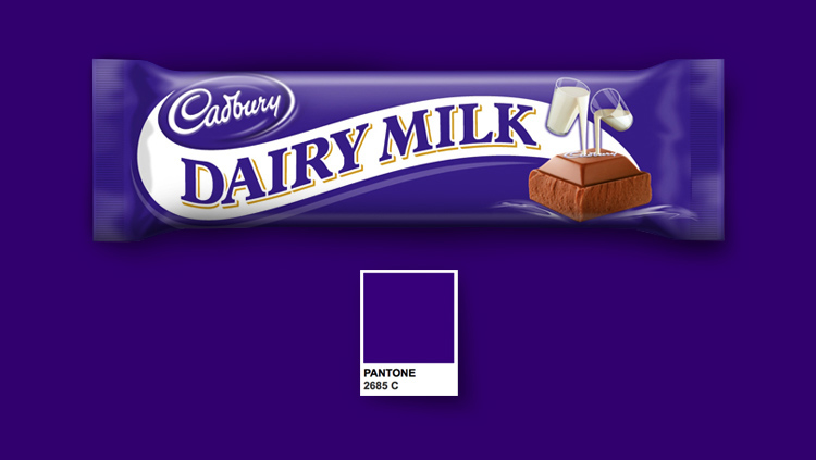
Is it acceptable for a brand to trademark a colour?Colour plays such an essential role in the identity of a brand. Think of the blue used in the Facebook logo, Caterpillars yellow or Home Depots orange. Then there's Coca Cola's red that's such a strong identity that it even managed to change the colour of Santa clause! But with this in mind, should these company's be allowed to own that specific colour? The confectionary company Cadbury lost a five year court battle to register their distinctive shade of purple, Pantone 2685C. The company stated that they had been using the colour on their Dairy Milk bars since the first world war. Lawyers for rival company Nestlé, who use a similar colour on their quality street packaging, overturned a previous judgment that prevented other manufacturers from using the colour. In closing the judges claimed that the colour alone did not constitute as the trademark but instead only played a part with other elements. The mobile phone prov...