Posts

Showing posts with the label Publishing

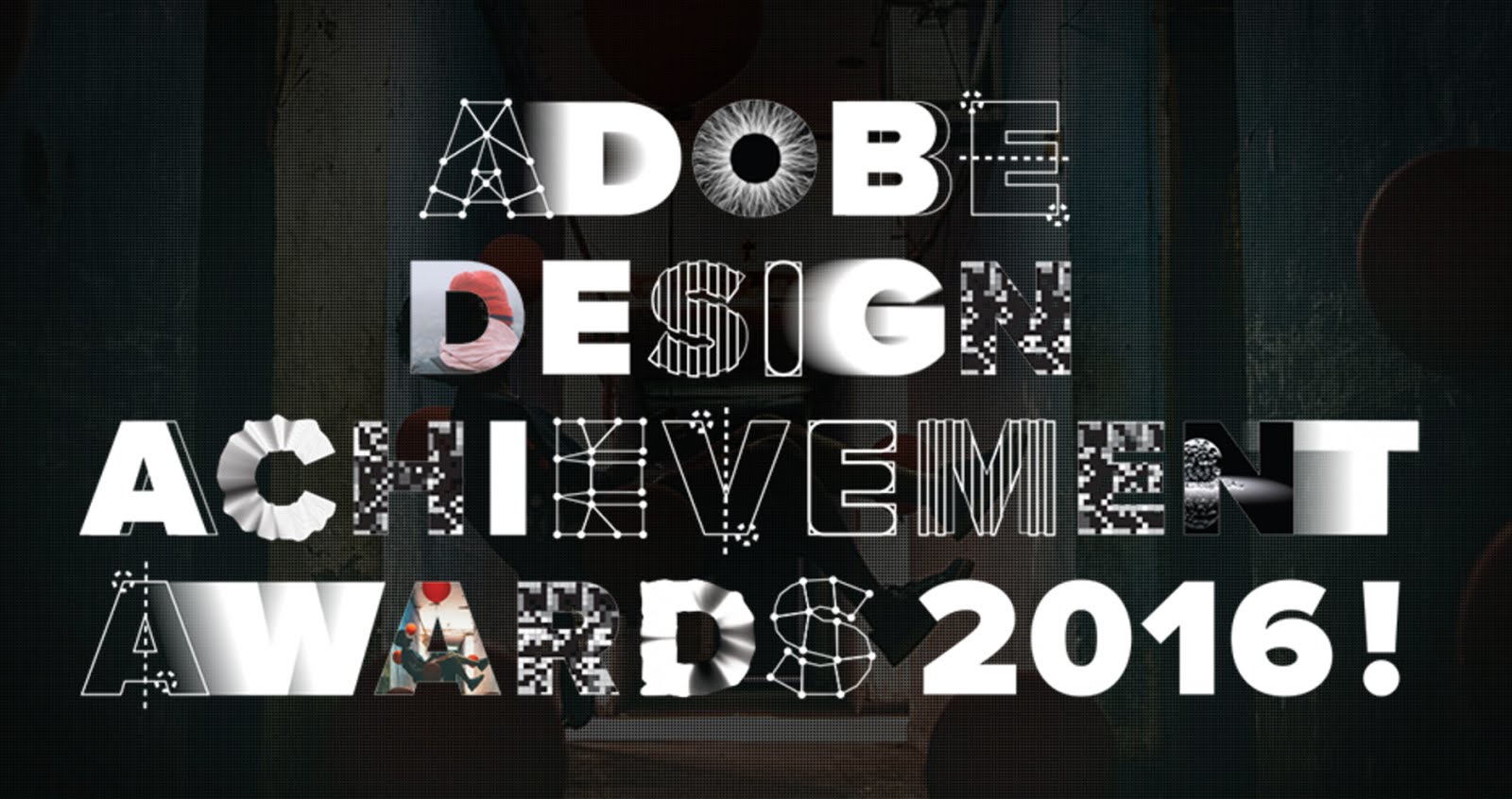
37 Great New Designers from Adobe Design Achievement Awards 2016
Image
For the past five years I have had the great pleasure of being selected as a mentor for the ico-D and Adobe design Achievement Awards . This year however, I had the added bonus of also being chosen as a pre selection judge! I really enjoy what the awards stand for and it always feels so good to be able to support young design talent! Below are some of the fantastic young/student designers that I discovered, whilst judging the awards. There's some amazing talent here! If your hiring new creatives I would certainly urge you to view some of these talented young design stars of tomorrow and please support the ADAA! https://www.behance.net/ gallery/35944337/COP-25- United-Nations-Climate-Change- conference https://www.behance.net/ gallery/27135599/environment https://www.behance.net/ gallery/36153385/Sanfonzon- Street-pop-up-book https://www.behance.net/ gallery/33968594/Letter-for- Truth-Logo https://www.behance.net/ gallery/30570553/ Beruehrungsangst-fear-of- touching https://www.beh...

My Copy of Graphis Diagrams

Image
In 1974 Walter Herdeg edited issue 165 of Graphis Diagrams, a square hardback book showing the scientific side of graphic design. It contains beautifully illustrated, full colour diagrams of abstract data and theres also some lovely multi layered maps that use transparent papers. The cover is a fantastic example of the modernist Swiss style of type and design. It really is a thing of beauty, an iconic classic and I once had a copy, or should I say, I may still have a copy... Somewhere! It wasn't that I forgot I had it, but instead that I was recently reminded when I turned to page 46 of Steven Heller and Veronique Vienne's fantastic book '100 Ideas That Changed Graphic Design', and there it was in all it's glory, featuring in the chapter 'The Square Format! I am not completely sure of how this book came into my life. My father was always great at picking up a bargain and may of bought it second hand for his son. My family always supported my love of everything c...

Annie Leibovitz & Jim Carrey - Vanity Fair White Cover Design

Image
This is one of those cover designs that every now and then shoots into my head. I worked as an art editor for a publishing company for many years and I know firsthand the importance of a cover design to really scream out from the shelf. With so many magazines vying for real-estate why would anyone buy yours! In a sea of red and luminous colours this November 1999 cover for Vanity Fair resonated from the shelves by doing the exact opposite and being minimal.   The cover shot of actor Jim Carrey has him against a white background. The composition of the actor is from the waist up, he is unclothed but completely covered in white make-up, the only area of colour being the actors eyes and lips. The image was taken by Annie Leibovitz and the design compliments this stunning photography. In fact the design is so restrained in its use of colour that the cover lines are only visible by the use of a light grey shadow. For me a truly memorable cover.

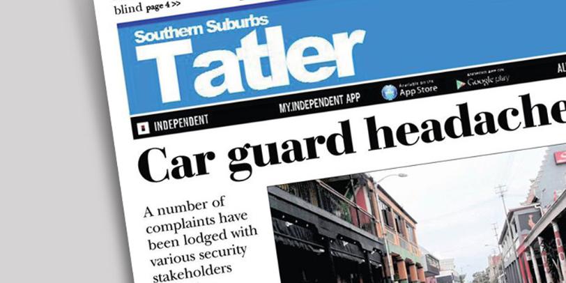
Tatler, T atler or just Tat?

Image
I have the highest of regard for local newspapers and for those who create them. I know firsthand the work that goes into each issue. If I ever travel somewhere new, a local newspaper is a great way to get an insight into the lives of the people who live there. They are often papers for locals put together by locals and neighbourhoods benefit greatly from their work. Just brilliant! I write this blog out of positivity so it's with the greatest of respect that I write this post. Ive been living in the Southern Suburbs of Cape Town for many years now and each time our local paper the 'Southern Suburbs Tatler' arrives in our postbox, I get a reminder of just how much it's masthead bothers me! I am sorry, but it just does! Its set in a San Serif and the 'atler' part of the word has been tracked back to an inch of its life, with each letter touching. I actually dont' mind this but what I do mind is the capital 'T' at the beginning of the word and how it s...

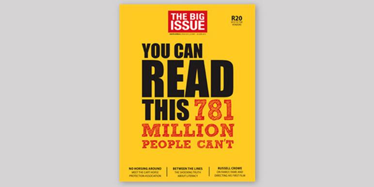
The Big Issue 231

Image
As I pulled up to the traffic lights, I was completely taken when I saw this eye catching cover to a recent edition of the Big Issue. I enjoyed the cover for so many reasons. Firstly the use of typography and colour to instantly connect with the audience is fantastic! The bright colours and the way that the designer has skilfully used hierarchy within the typesetting really captures you! I also like how the size of the logo header is kept to a minimum to give more gravatas to the strong and poignant headline copy that pulls you in even further, 'You can read this, 781 million people can't.' The article inside is also brilliant! Please click here and support the Big Issue and the incredible work that they do!