Posts

Showing posts with the label Advertising

Design for Woolworth Longmarket Soap Shop

Image
A recent project that I had the great pleasure to work on with the brilliant Woolworths beauty team is getting some positive attention at the Woolworths Instagram page. This is the new oval tin that we have just introduced with a flat lid base, for the Longmarket Soap Shops Say “thank you for putting up with my kid all year” with these small but thoughtful gifts for Teachers. #linkinbio #findthemagic A photo posted by WOOLWORTHS SA (@woolworths_sa) on Nov 9, 2016 at 5:41am PST
Quantas Brand Update

Image
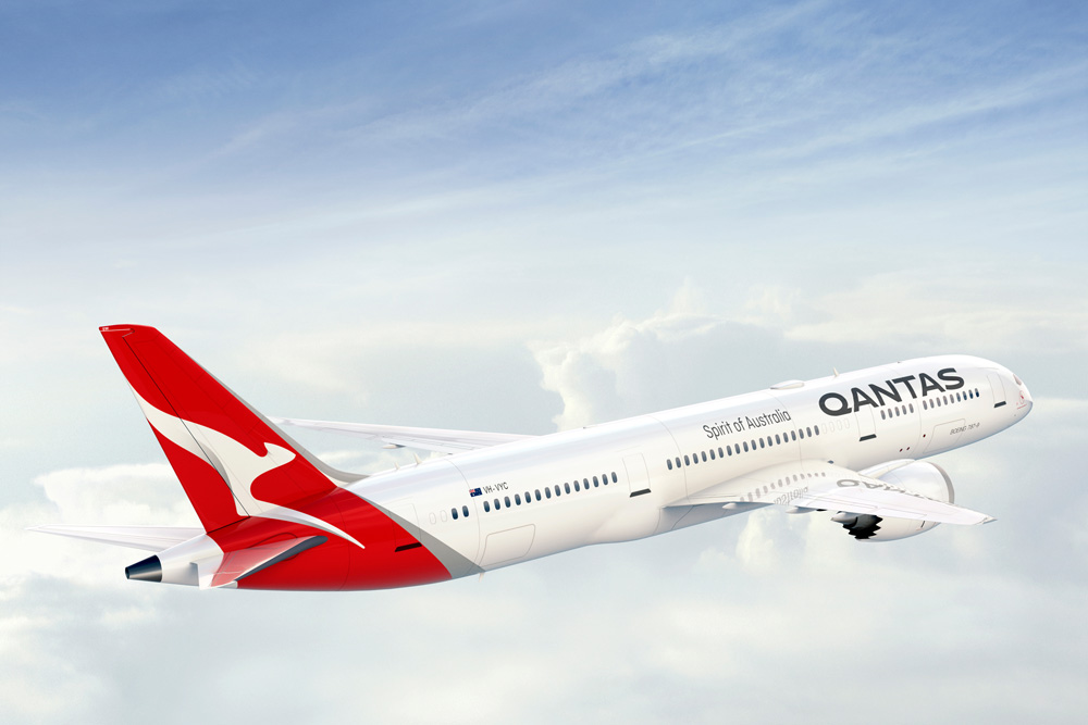
Australia’s largest airline has introduced a new logo and livery, designed in partnership with Quantas consultant Marc Newson and Australian branding agency Houston group. In a press release, Quantas write: The change is only the fifth time the red-and-white image on the tail of Qantas aircraft has been updated since it was first introduced in 1944. The last update was in 2007 to coincide with the introduction of the Airbus A380 to the national carrier’s fleet. Marc Newson, who has helped design Qantas’ lounges, the A380 cabin and the iconic Skybed, said: “Aircraft tails are fantastic canvas to work on and the Qantas logo is one of the most recognisable in the world. This re-design aims to retain the fundamental essence of the flying kangaroo but also move the brand forward. “This new brand is more streamlined and the shading behind the kangaroo gives a better sense of movement and depth.   On the Houston Group Project Page: The key opportunity for us was in contemporisin...

Origin of the Red Bull Brand

Image
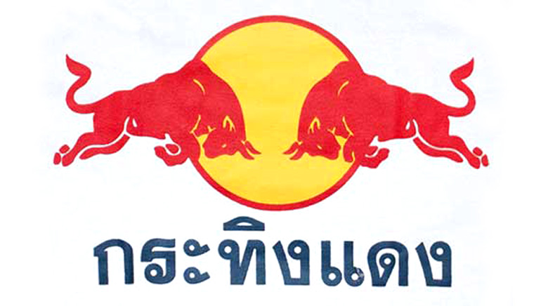
I will always remember my first trip to Thailand! It was one of those life affirming moments, a sensory overload of experience and learning!!! Travelling has been a great way for me to experience other brands and how consumers interact with them on a daily basis. Brands that I have never seen before visiting that country. Brands that are like the ones I grew up with but different! I love it.  One of the most confusing for me was seeing what look liked the Red Bull brand, but when I tasted the product, it wasn't fizzy and was a lot thicker and more like a syrup. It seemed stronger in it's effects and they were sellking T shirts everywhere with the two bull branding on. It looked like the brand, but the product was different. Over the years, I read more and started to understand why this was. The followi ng excerpt exp lains why this was! I found this excerpt from global design agency, JKR's book ' Champions of Design 4 ', and it's a really interesting read, espec...

A History of the KFC Brand & the New Design!

Image
A brief History of the Kentucky Fried Chicken brand. Kentucky Fried Chicken was founded by Harland Sanders, who began selling chicken from his roadside restaurant in Corbin Kentucky in the 1930's. An entrepreneur, Sanders identified the potential of franchising his restaurant concept and the very first "Kentucky Fried Chicken" franchise opened in Salt Lake City in Utah in 1952 by Pete Harman who was both the owner of one of the cities largest restaurants and a good friend of Sanders. Harman hired a sign writer named Don Anderson to work on the first restaurant, who coined the name "Kentucky Fried Chicken" creating a good product differentiator (being chicken) and a vision of southern hospitality for the brand. Harman also introduced the "bucket meal" and trademarked the phrase "Its finger Lickin' good", which over time have both played an important role within the companies identity and advertising. With my interest in branding, packaging...

City Of Cape Town - I have A Drug Problem Campaign

Image
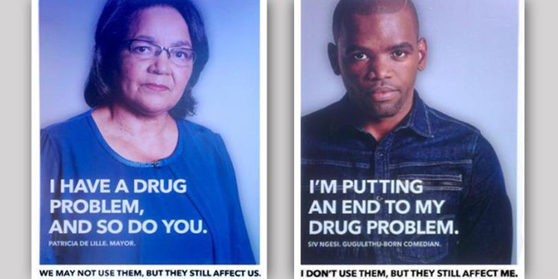
This fantastic poster campaign by King James for the city of Cape Town was launched last year and features a number of well known local personalities, including singer Jimmy Nevis, DJ Ian Bredenkamp, comedian Siv Ngesi and even the Mayor Patricia De Lille (to name just a few) in a fight against substance abuse. I'm a great supporter of this campaign. Its strong photography and use of bold clean typography is brilliant, but like the celebrities, I also have a problem but mines not a drug related one, but instead to do with the posters copy writing... In the posters the personalities state their name and that they "have a (serious) drug problem" or "I'm putting an end to my drug problem". For me the double entendre would of worked better if they would of stated that "I have a (serious) problem with drugs" or "I'm putting an end to my problem with drugs". I know it's a subtle change, but it just plays on me each time I see it, which ...

Century City Conference Centre

Image
Reading through the newspapers recently, I came across this advert for the new Century City Conference Centre, opening in Cape Town early this year. I really like the branding that cleverly encompasses the four 'C's from the name and the clean type selection that's used in two weights. I also thought that the advert was very well executed. All in all a nice piece of work. Click here  to read more about this exciting new project.   

My Interest In Vintage Design

Image
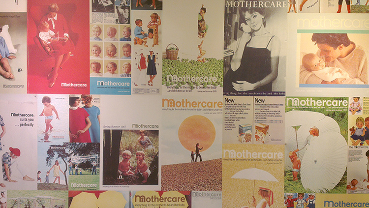
This is my first post featuring my deep interest for vintage branding and packaging design. My fascination began whilst a student where we would often visit the Robert Opie museum of vintage packaging at the Gloucester Docks in England. From that point on I was hooked and it's since grown into a leisure pursuit (some might say obsession) of mine, with my poor wife and son often having our trips away interrupted with me snapping away at old boxes and signs. The invention of the cell phone camera has probably saved our house from a man cave filled with the stuff. To this end, I look forward to sharing my interest on the evolution of some of our most well known brands and packaging designs. Some have changed subtlety, yet others have had a complete face lift throughout their life span. We often take them for granted, but we live with these items and symbols every single day. They communicate, guide us and often without us even being aware of it, have a deep attachment to them, like an...

20 Years of Design Indaba

Image
The World-renowned 'design Indaba' conference takes place each year in February at Cape Town’s CTICC conference centre. The event sits at the top of the design community’s calendar with the three-day program including presentations and insight from both the worlds most established and celebrated creative professionals along with local up and coming talent. Renowned graphic designer Michael Bierut has helped host the conference since 2010 and will be returned this year to also present. This years (2015) distinguished speakers included co founder of the world renown advertising agency Wieden+Kennedy, Dan Wieden who was the brain child of the Nike tagline "Just Do It", Stanley Hainsworth who has held senior creative positions at Lego, Starbucks and Nike and Pentagrams Emily Oberman. Managing director and founder of the Design Indaba is RavI Naidoo who was also the brainchild behind Interactive Africa, responsible for high profile projects including the “First African in ...

Addicted To Chaos - Inspiration From Dan Wieden

Image
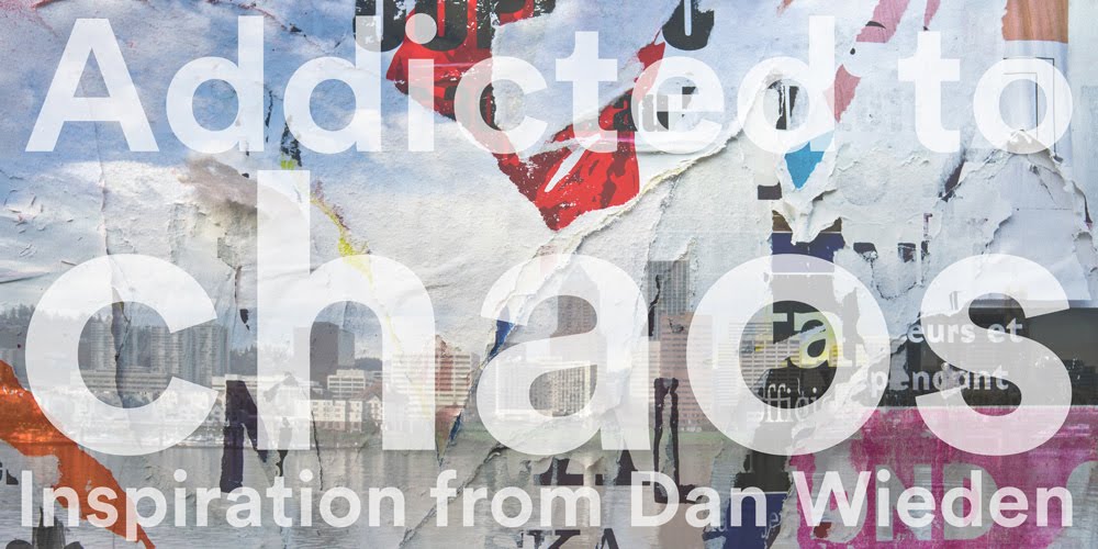
Last year Dan Wieden spoke at Cape Town's Design Indaba conference. Wieden's words have inspired me for many years, so it was a rare opportunity to hear one of the most respected authorities on advertising and creative thinking speak in person. Wieden is probably best know for co-founding one of the worlds most admired advertising agencies; Wieden+Kennedy and coining the Nike tagline "Just Do It." Incidentally Wieden pitched the idea to Nike in 1988 after he had read a newspaper article about Gary Gilmore who was sentenced to death for murder. The condemned man was reported as saying “let’s do this” as he faced a firing squad. Wieden suggested a slightly altered version as the slogan, changing it to "just Do It". The rest as they say is history. In his Design Indaba presentation, Wieden spoke on the importance of allowing yourself to be able to fail and his addiction to Chaos! Many years ago I stumbled across the ' Welcome to Optimism ' blog which i...

Why Pink & Blue?

Image
I recently became a dad to a wonderful, amazing little boy and he is definitely the most loved new addition to my design life. Whilst my wife was still pregnant, we decided that we did not want to know the babies sex before the birth and loved the idea of it being a surprise. This however was met with some shock and surprise from a good many of our friends who just couldn't believe that we wouldn't want to know this in advance. How could we possibly prepare if we didn't know what colour to decorate the babies room or buy them clothes? I suddenly started to ask myself why! Who decided that pink was a feminine colour and blue masculine. The marketeers? The branding experts? More so, why is there actually a need for a gender based distinction? At this point my curiosity kicked in and I suddenly wanted some answers. After some research, I found images of babies clothing from the 18th century, showing both girls and boys in white frilly dress style outfits. Many articles claim t...