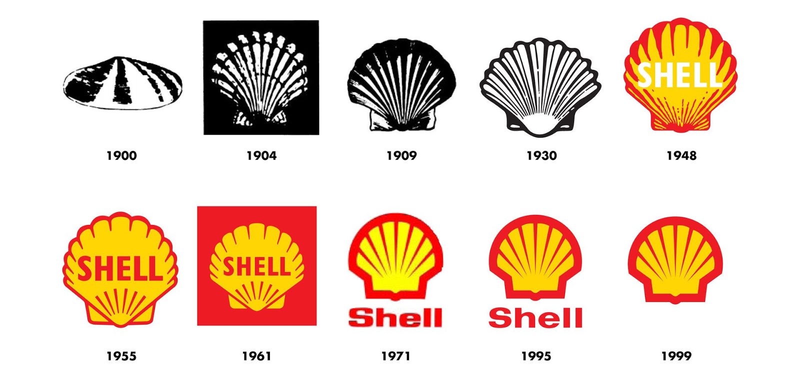
The History of the Shell Logo
This is the history of one of the worlds most recognised brands.
For more than 100 years the Shell pecten emblem and distinctive red and yellow colours have visualised the Shell brand and promoted the company's products and services all over the world.
The Shell logo has changed considerably since it's inception in 1900, yet you can still apreciate it's iconic form, whether viewing the original logo or in its current form.
I always remember Michael Wolff recounting his work on a redesign of the Shell logo, whilst running his agency, Wolff Olins. Wolff chose to simply warm up the colours. As he says, sometimes its what you don't change, that can be as important as what you do. That couldn't be more true than with the the iconic symbol of the red and yellow shell icon.

I stumbled across this brief history of the brand on the company website and thought it was well worth a read.
The word Shell first appeared in 1891, as the trademark for kerosene shipped to the Far East by Marcus Samuel and Company. This small London business dealt originally in antiques, curios and oriental seashells. These became so popular – the Victorians used them to decorate trinket boxes in particular – that soon they formed the basis of the company’s profitable import and export trade with the Far East.
The word was elevated to corporate status in 1897, when Samuel formed the Shell Transport and Trading Company. The first logo in 1901 was a mussel shell, but by 1904 a scallop shell or pecten emblem had been introduced to give a visual representation of the corporate and brand name.
When the Royal Dutch Petroleum Company and Shell Transport and Trading merged in 1907, the latter’s brand name and symbol (Shell and the pecten) became the short-form name and emblem of the new Royal Dutch Shell Group. And so it has remained ever since.
The form of the Shell emblem has changed gradually over the years in line with trends in graphic design. The current emblem was introduced in 1971. Thirty years on it stands the test of time as one of the world’s most recognised symbols.


Comments
Post a Comment