The Big Issue 231
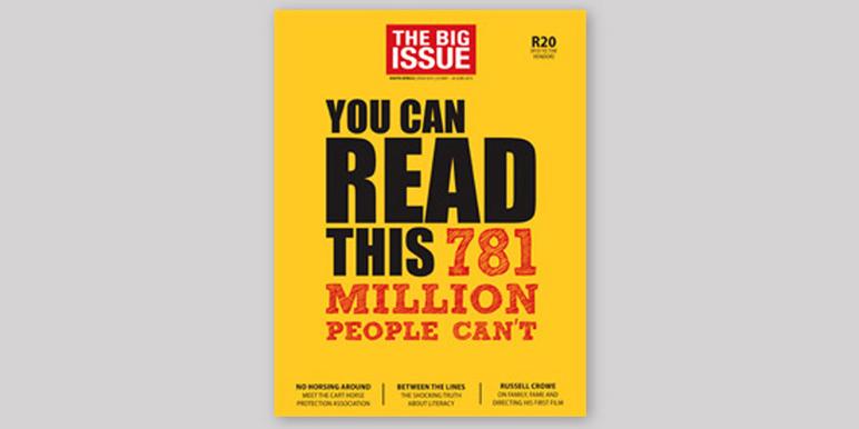
As I pulled up to the traffic lights, I was completely taken when I saw this eye catching cover to a recent edition of the Big Issue. I enjoyed the cover for so many reasons. Firstly the use of typography and colour to instantly connect with the audience is fantastic!
The bright colours and the way that the designer has skilfully used hierarchy within the typesetting really captures you! I also like how the size of the logo header is kept to a minimum to give more gravatas to the strong and poignant headline copy that pulls you in even further, 'You can read this, 781 million people can't.' The article inside is also brilliant!
Please click here and support the Big Issue and the incredible work that they do!

Comments
Post a Comment