The Story of Hungry Jacks & A Packaging Rebrand for Burger King
I am currently living in South Africa and Burger King only arrived here in 2013, with it's first franchise opening in the may of that year in Cape Town. This was 18 years after it's competitor Mc Donnalds arrived. Burger King however decided to take a similar tack as Nandos when the South African Company opened in the UK. To differentiate it from KFC, Nandos positioned itself as a higher end brand offering. Burger King used this same tactic when moving into ZA and it seems to be working for them, at least for now, with huge cues outside it's restaurants. That said the company currently have only 12 outlets compared to over 200 McDonnalds franchises.


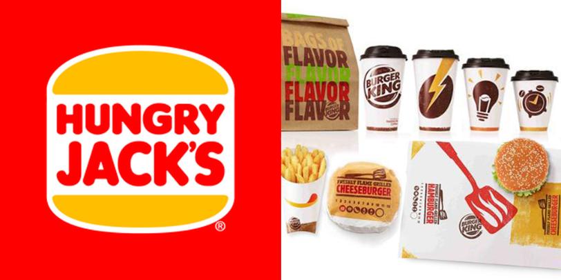
The new visual language is fun and colourful, utilising a colour palette of red, green, yellow and brown to represent the ketchup, lettuce, cheese and the flame grilled beef burger. The design adopts a distressed and hand printed effect to create the feel of individuality that the flame grilling gives to each beef patty.The design was also created to help staff serve food faster and be more efficaint. The symbol of the spatular helps staff locate the burger on the wrap and the packet for the fries creates a smile out of a chip (the mouth) and ketchup (Tongue). Coffee cups have symbols representing the power shot you get from the hot beverage and the paper takeaway bags use the striking four colour palette.

This striking new design will soon be rolled out to Burger King's thirteen thousand stores, in almost 100 countries. You can read more at the Dieline by clicking here.

Comments
Post a Comment