Posts

Showing posts from March, 2016

Logo Modernism

Image
This fantastic new book by Jens Müller; 'Logo Modernism', recently caught my eye and is now at the top of my Christmas list! Published by Taschen the book features approximately 6000 trademarks/logo's, focusing on the forty-year period between 1940 to 1980. Whist reading through the design press, this fantastic new book by Jens Müller; 'Logo Modernism', caught my eye and is now at the top of my Christmas list!  Published by Taschen the book features approximately 6000 trademarks/logo's, focusing on the forty-year period between 1940 to 1980, a time where Paul Rand, Soul Bass and Massimo Vignelli were changing the industry with their modernist approach to corporate identity. The book is divided into three chapters; geometric, effect, and typographic and then broken down further into sub divisions for style and form. The book is set in three languages English, French and German and is available for pre-order through Amazon.com or the publisher Taschen , with the
Vintage & Rare Collection Of Beer Packaging

Image
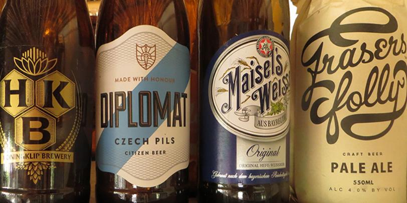
This wonderful collection of vintage and rare beer packaging from all over the world can be seen at the Wild Clover micro Brewery. A veritable feast for any branding and packaging designer/vintage packaging enthusiast like myself! The owner Ampie Kruger kindly let me take these images of the full collection of labels whilst telling me the amazing story of how it was donated to him. Apparently the original collectors wife insisted that he give this incredible treasure away!!! Wild Clover produces four wonderful beers that I can highly recommend: Double Owl English Brown Ale, Black Dog Smokey Irish Porter, Blind Mole Crispy German Pils and Eagle Weiss Fruity Belgian Wit. You can visit Wild Clovers micro Brewery at: Wild Clover Farm, R304, Stellenbosch, Telephone: +27 (0)21-865-2248, www.cloverfarm.co.za                              

Annie Leibovitz & Jim Carrey - Vanity Fair White Cover Design

Image
This is one of those cover designs that every now and then shoots into my head. I worked as an art editor for a publishing company for many years and I know firsthand the importance of a cover design to really scream out from the shelf. With so many magazines vying for real-estate why would anyone buy yours! In a sea of red and luminous colours this November 1999 cover for Vanity Fair resonated from the shelves by doing the exact opposite and being minimal.   The cover shot of actor Jim Carrey has him against a white background. The composition of the actor is from the waist up, he is unclothed but completely covered in white make-up, the only area of colour being the actors eyes and lips. The image was taken by Annie Leibovitz and the design compliments this stunning photography. In fact the design is so restrained in its use of colour that the cover lines are only visible by the use of a light grey shadow. For me a truly memorable cover.

Artist Builds A Car From 25,000 Cell Phones

Image
A  Taiwanese artist has spent the past four months working on a life-size car made out of 25,000 cell phones. Lin Shih-Pao has spent four years travelling the world, collecting old and discarded mobile phones for the work of art. The installation took four years to complete. The phones are are glues and nailed around an internal wooden frame. The artist created the piece of modern art as a way of spreading environmental awareness and is a statement on the importance of recycling electronic waste.

Channel 4 Rebrand

Image
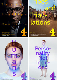
Channel 4 Rebrand from DBLG on Vimeo . I am extremely excited about the new Channel 4 redesign. Above is the story in 01:16.  The Channel 4 in-house team  4creative  worked in collaboration with  DBLG  and  SQUA  for on-air package,  Brody Associates  for custom typefaces, and  Jonathan Glazer  for dents.      

City Of Cape Town - I have A Drug Problem Campaign

Image
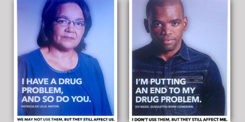
This fantastic poster campaign by King James for the city of Cape Town was launched last year and features a number of well known local personalities, including singer Jimmy Nevis, DJ Ian Bredenkamp, comedian Siv Ngesi and even the Mayor Patricia De Lille (to name just a few) in a fight against substance abuse. I'm a great supporter of this campaign. Its strong photography and use of bold clean typography is brilliant, but like the celebrities, I also have a problem but mines not a drug related one, but instead to do with the posters copy writing... In the posters the personalities state their name and that they "have a (serious) drug problem" or "I'm putting an end to my drug problem". For me the double entendre would of worked better if they would of stated that "I have a (serious) problem with drugs" or "I'm putting an end to my problem with drugs". I know it's a subtle change, but it just plays on me each time I see it, which

Facebook Face Lift Addresses Gender Equality

Image
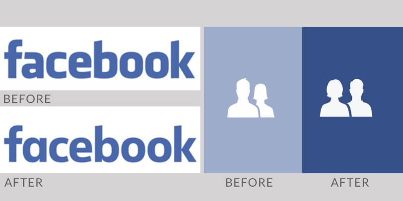
Facebook has a new corporate identity designed in collaboration with it's in house team and Process Type Foundry’s Eric Olson. Although the new brand mark is a subtle move on there are a number of changes. Generally the characters are a lot more rounded (especially the ‘e’ and ‘o’). The original logos 'f' and 'a' worked together whereas the new logo has a single story ‘a’, The ‘b’ now has a prominent stem and overall its less bold in weight than the original. This revised brand mark replaces the original logo designed in 2005 by Joe Kral and Cuban Council, which used Process Type Foundry’s font Klava as a starting point. You can read more at Under Consideration's website Brand New by clicking here . Another of Facebook's iconic logos which is also changing is the small friends icon. The image of a man and a woman that sits in the corner of the sites pages will soon look different thanks to the company’s in house designer Caitlin Winner. The previous logo of

Back To The Future... 30 Years On

Image
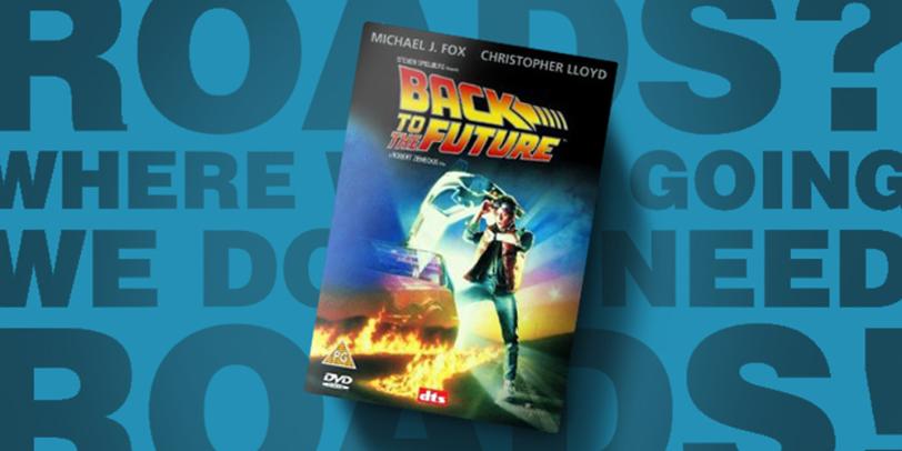
Last year (the 3rd of July 2015), marked the 30th anniversary of the release of the original 'Back to the Future' movie. It features the fantastic quote: "Roads! Where were going we don't need roads." The 1980's were such a golden time for me growing up and this particular movie played it's part in my transition from a boy to a young adult. Yep I was one of those kids that sported the Marty McFly inspired look which included a body warmer, the tongues of my ankle high sports shoe sticking out over the sprayed on bleached jeans and of course topped off with a mullet ! Yep, I was that cool back then!!! If your one of my younger readers or if you were stranded on a desert island back in the 1980/90's then the premise of the movie is that an eccentric scientist Doc Brown (played by Christopher Lloyd) builds a time machine out of a DeLorean (that's an iconic 1980's sports car if you were looking for a message in a bottle on that island) and sends te

Eiffel Tower Peace Symbol Goes Viral - The Art of Jean Jullien

Image
French graphic artist Jean Jullien has created a symbol that is likely to become the most iconic and widely shared image following the Paris terrorist attacks. Created in an act of spontaneity, it has become a worldwide symbol of solidarity. The symbol is clear proof of the power of visual imagery and how a small but clever change can make such a powerful difference and become iconic in it's own right. His reworking of the peace symbol cleverly replaces the bomb-like line structure from the original logo with that of the Eiffel tower to create a memorable poignant symbol. The logo has gone viral across social media and has already made its way onto t-shirts.

Century City Conference Centre

Image
Reading through the newspapers recently, I came across this advert for the new Century City Conference Centre, opening in Cape Town early this year. I really like the branding that cleverly encompasses the four 'C's from the name and the clean type selection that's used in two weights. I also thought that the advert was very well executed. All in all a nice piece of work. Click here  to read more about this exciting new project.   

A Happy Face for IHOP Rebrand

Image
My first visit to the US was to Florida. It was way back in 2000 and I traveled there to complete a course in sky diving. On the drive to the airfield each morning we would often make a stop at the local IHOP (international House of Pancakes) restaurant to fill up on food before an exhilarating day of jumping out of a perfectly good aeroplane! I always remember the poster on the window of that particular IHOP which read "Steak isn't just for breakfast!". For a small town boy from the west country of England, the idea of eating steak at all for breakfast seemed like a very alien concept! Back then I was opening up to new experiences hence the sky diving, but steak for breakfast!!! That I couldn't quite grasp. Ive since spent a good deal of time in the US and have seen almost all of it's States! Convenience and fast foods are ingrained into the country's culture and the brands that relate to these eateries and their history are of interest to me, so when I recen

Tatler, T atler or just Tat?

Image
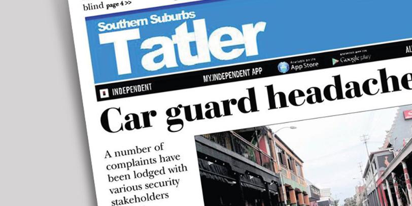
I have the highest of regard for local newspapers and for those who create them. I know firsthand the work that goes into each issue. If I ever travel somewhere new, a local newspaper is a great way to get an insight into the lives of the people who live there. They are often papers for locals put together by locals and neighbourhoods benefit greatly from their work. Just brilliant! I write this blog out of positivity so it's with the greatest of respect that I write this post. Ive been living in the Southern Suburbs of Cape Town for many years now and each time our local paper the 'Southern Suburbs Tatler' arrives in our postbox, I get a reminder of just how much it's masthead bothers me! I am sorry, but it just does! Its set in a San Serif and the 'atler' part of the word has been tracked back to an inch of its life, with each letter touching. I actually dont' mind this but what I do mind is the capital 'T' at the beginning of the word and how it s

The Big Issue 231

Image
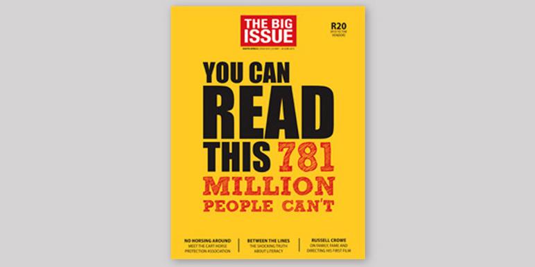
As I pulled up to the traffic lights, I was completely taken when I saw this eye catching cover to a recent edition of the Big Issue. I enjoyed the cover for so many reasons. Firstly the use of typography and colour to instantly connect with the audience is fantastic! The bright colours and the way that the designer has skilfully used hierarchy within the typesetting really captures you! I also like how the size of the logo header is kept to a minimum to give more gravatas to the strong and poignant headline copy that pulls you in even further, 'You can read this, 781 million people can't.' The article inside is also brilliant! Please click here and support the Big Issue and the incredible work that they do!