Facebook Face Lift Addresses Gender Equality
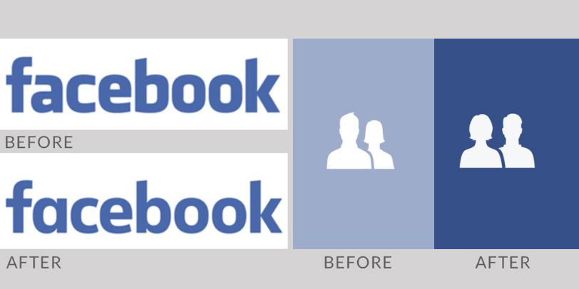
Facebook has a new corporate identity designed in collaboration with it's in house team and Process Type Foundry’s Eric Olson. Although the new brand mark is a subtle move on there are a number of changes. Generally the characters are a lot more rounded (especially the ‘e’ and ‘o’). The original logos 'f' and 'a' worked together whereas the new logo has a single story ‘a’, The ‘b’ now has a prominent stem and overall its less bold in weight than the original.
This revised brand mark replaces the original logo designed in 2005 by Joe Kral and Cuban Council, which used Process Type Foundry’s font Klava as a starting point. You can read more at Under Consideration's website Brand New by clicking here.
Another of Facebook's iconic logos which is also changing is the small friends icon. The image of a man and a woman that sits in the corner of the sites pages will soon look different thanks to the company’s in house designer Caitlin Winner.
The previous logo of the woman’s silhouette behind that of a man will soon switch around. Furthermore the original logo has the woman smaller, whereas the new icon now has them equal in size. There’s also some new detailing to the characters shape and to their hairstyles. Winner comments that the woman’s hairstyle of the original logo resembled a “ Darth Vader-like helmet.”
Click here to read npr.org article, which features more from Caitlin Winner and the icons recent change.

Comments
Post a Comment