Posts

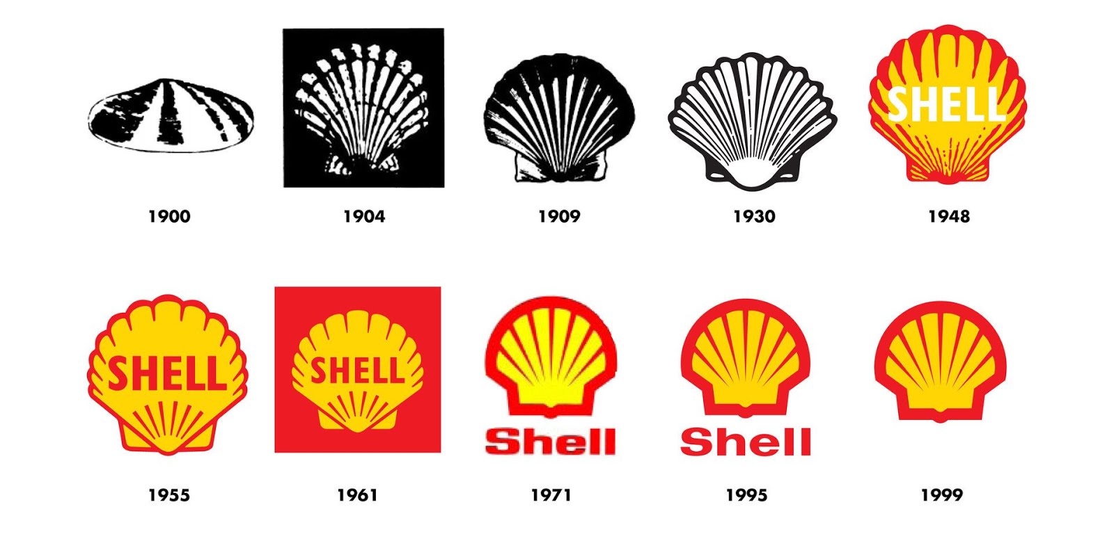
The History of the Shell Logo
Image
This is the history of one of the worlds most recognised brands.  For more than 100 years the Shell pecten emblem and distinctive red and yellow colours have visualised the Shell brand and promoted the company's products and services all over the world. The Shell logo has changed considerably since it's inception in 1900, yet you can still apreciate it's iconic form, whether viewing the original logo or in its current form. I always remember Michael Wolff recounting his work on a redesign of the Shell logo, whilst running his agency, Wolff Olins. Wolff chose to simply warm up the colours. As he says, sometimes its what you don't change, that can be as important as what you do. That couldn't be more true than with the the iconic symbol of the red and yellow shell icon. I stumbled across this brief history of the brand on the company website  and thought it was well worth a read. The word Shell first appeared in 1891, as the trademark for kerosene shipped to the Far E...
Origin of the Red Bull Brand

Image
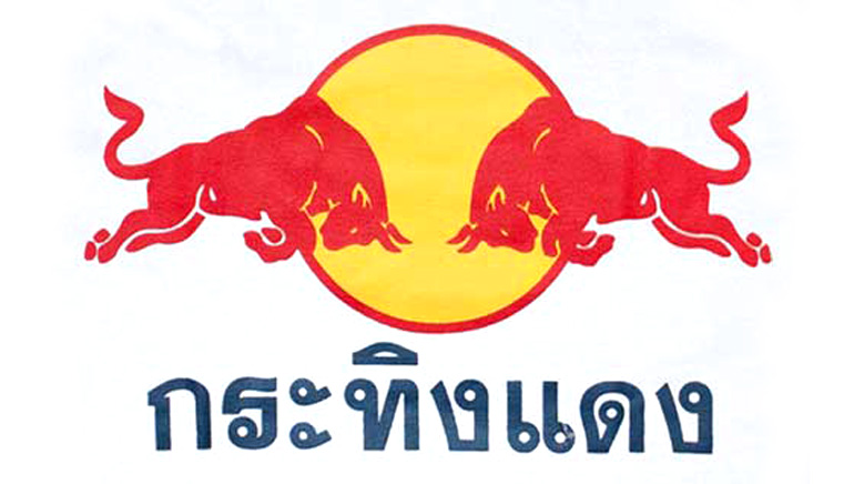
I will always remember my first trip to Thailand! It was one of those life affirming moments, a sensory overload of experience and learning!!! Travelling has been a great way for me to experience other brands and how consumers interact with them on a daily basis. Brands that I have never seen before visiting that country. Brands that are like the ones I grew up with but different! I love it.  One of the most confusing for me was seeing what look liked the Red Bull brand, but when I tasted the product, it wasn't fizzy and was a lot thicker and more like a syrup. It seemed stronger in it's effects and they were sellking T shirts everywhere with the two bull branding on. It looked like the brand, but the product was different. Over the years, I read more and started to understand why this was. The followi ng excerpt exp lains why this was! I found this excerpt from global design agency, JKR's book ' Champions of Design 4 ', and it's a really interesting read, espec...

Edible Drone - The Future of Aid Delivery

Image
This incredible invention from Windhorse Aerospace could see a revolution in the way the world delivers aid to those effected by natural disasters. The Windhorse website writes: "For the first time ever, aid will be delivered accurately to those in desperate need with this use of a revolutionary and unique Unmanned Air Vehicle (UAV). There were over 125 natural disasters last year, add this to areas of conflict and the number of people starving as a result gets to breath taking levels. Access to the people affected can be restricted due to the loss of infrastructure and many other dangers. Also, traditional methods of deploying aid can be ineffective, inaccurate or just impossible to use. Windhorse has developed a specialist UAV called POUNCER™ that will be loaded with appropriate food, transported to the disaster area and fly independently to its pre-planned destination and land accurately into the selected landing zone, avoiding all infrastructure problems, corruption or hostile...

10 Ways To Be More Creative

Image
Ever wondered how to improve your creativity and stay inspired? Why some designers have been a lot more successful than others? Well read on... I recently wrote a post for the design life , which also featured here, titled, " The Most Important Word You Use Is Why !" The post was inspired by an incredibly motivating Design Indaba presentation by Sir John Hegarty, that I was lucky enough to attend back in 2013. Just the other day, I was reading through the design press and I stumbled upon a fantastic article at The Drum by Ishbel Macleod . The feature was based on Sir John Hegarty's 2014 book, 'Hegarty on Creativity' and lists his top 10 ways to be more creative. Check out number 8... 'Ask Why? A lot!' I have re blogged the list below as it makes for super reading: 1 Be fearless - be single minded in the face of opposition 2 Keep it simple - don't try to say or do too many things at once 3 Stop thinking, start feeling -creativity is driven by the heart...

Wadmans Organic Food / Branding & Packaging Design Concept

Image
A concept project that I've been working on, recently received some interest from within the design industry, featuring on both Packaging of the World and the Dieline's 'Concepts We wish Were Real' . You can see the full project at Bechance . THE PROJECT At least once a year I return back to the UK to visit my family and friends. I get to travel the length and breadth of England, from London and the West Country, up to Lancashire, with a good many stops in between. Whilst there, I always try and fit in some design research. I visit as many retail stores, supermarkets, farm shops and craft brewery’s as possible, taking in new and interesting branding and packaging design. It becomes an invaluable source for my commercial design work as the creative director of a successful Cape Town based design studio. Occasionally it can even inspire a personal project and this was the case with the Wadmans Organic Food concept. Keen to take my rough ideas through to final visuals, I ...

New Logo For MasterCard Designed By Pentagram

Image
The new logo for Mastercard, designed by Pentagram, has been raising eyebrows online and seems to be dividing the design industry on whether people are in favour or not. I for one am a huge fan of the new design! I love how Pentagram have looked back at the heritage of the logo and brought back original elements, yet balanced it perfectly to create a brand-mark that is ultimately very modern and uncluttered. This is most evident within the choice of a clean and modern type style that has been employed, all in lower case and now moved below the symbol for the first time. This logo is a success for me in the same way that the updated Google logo was last year. Great branding is about creating a simple iconic message. Look at Apple, Nike or what the red cross means to us all. These are forms at their simplest that instantly connect with us and this is why the pared down and modenised re-working is so successful for me. What are your thoughts on the revised, paired down design? Below is th...

Sainsbury's Design Studio 1962-1977

Image
I am an avid collector of design books and on a recent trip back to the UK, I stumbled across a fantastic book containing a veritable gold mine of vintage Sainsbury’s packaging, chronicling the years 1962 to 1977. The books forward tells the story of the author, Jonny Trunk and his search for a particular 1970 Sainsbury’s pack design for cornflakes that he had memories of from his childhood. On calling the retailers head office, he discovers that there’s a huge archive of pristine Sainsbury’s own label packaging dating back from the 1960’s and onwards. An ideal subject for a book! There is also an essay from Emily King, which gives an insight into the relationship between the company director, forward thinking JD Sainsbury and the visionary designer Peter Dixon who founded the Sainsbury’s in house creative studio and spearheaded it’s unique pack designs.       Also of note is the important role that the company played in society. Britain was going through a period of soci...