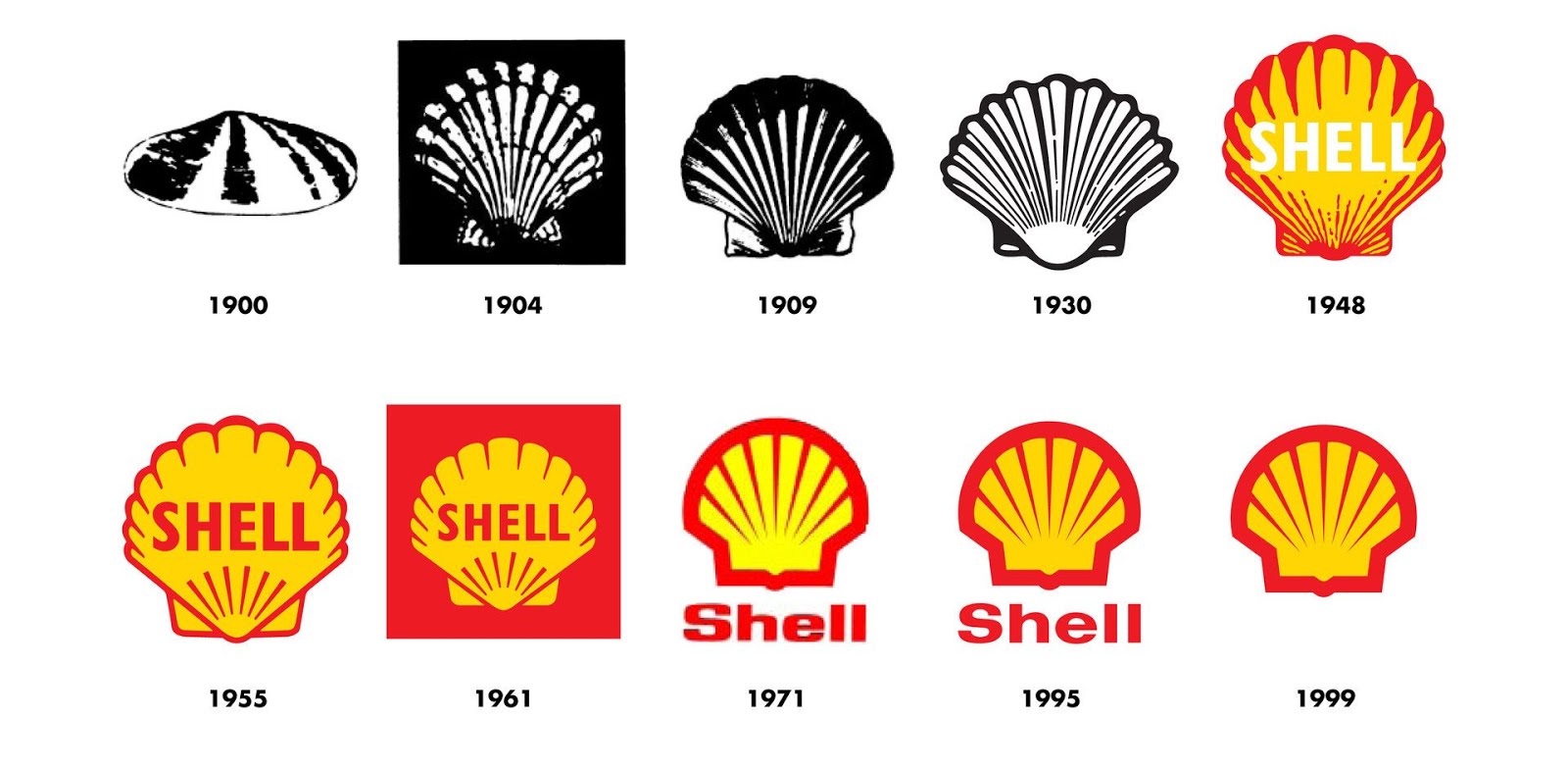
This is the history of one of the worlds most recognised brands. For more than 100 years the Shell pecten emblem and distinctive red and yellow colours have visualised the Shell brand and promoted the company's products and services all over the world. The Shell logo has changed considerably since it's inception in 1900, yet you can still apreciate it's iconic form, whether viewing the original logo or in its current form. I always remember Michael Wolff recounting his work on a redesign of the Shell logo, whilst running his agency, Wolff Olins. Wolff chose to simply warm up the colours. As he says, sometimes its what you don't change, that can be as important as what you do. That couldn't be more true than with the the iconic symbol of the red and yellow shell icon. I stumbled across this brief history of the brand on the company website and thought it was well worth a read. The word Shell first appeared in 1891, as the trademark for kerosene shipped to the Far E...
Ever wondered how to improve your creativity and stay inspired? Why some designers have been a lot more successful than others? Well read on... I recently wrote a post for the design life , which also featured here, titled, " The Most Important Word You Use Is Why !" The post was inspired by an incredibly motivating Design Indaba presentation by Sir John Hegarty, that I was lucky enough to attend back in 2013. Just the other day, I was reading through the design press and I stumbled upon a fantastic article at The Drum by Ishbel Macleod . The feature was based on Sir John Hegarty's 2014 book, 'Hegarty on Creativity' and lists his top 10 ways to be more creative. Check out number 8... 'Ask Why? A lot!' I have re blogged the list below as it makes for super reading: 1 Be fearless - be single minded in the face of opposition 2 Keep it simple - don't try to say or do too many things at once 3 Stop thinking, start feeling -creativity is driven by the heart...
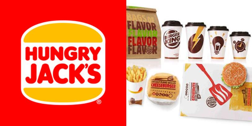
Burger King as a brand has long interested me. Ive spent time in Australia where the franchise is instead known as Hungry Jacks. In 1971 the company wanted to make a move into Australia with it's first franchise in Perth but was unable to use the Burger King name as it was already trademarked by an Adelaide based Food Shop. I am currently living in South Africa and Burger King only arrived here in 2013, with it's first franchise opening in the may of that year in Cape Town. This was 18 years after it's competitor Mc Donnalds arrived. Burger King however decided to take a similar tack as Nandos when the South African Company opened in the UK. To differentiate it from KFC, Nandos positioned itself as a higher end brand offering. Burger King used this same tactic when moving into ZA and it seems to be working for them, at least for now, with huge cues outside it's restaurants. That said the company currently have only 12 outlets compared to over 200 McDonnalds franchises. ...
Comments
Post a Comment