Quantas Brand Update
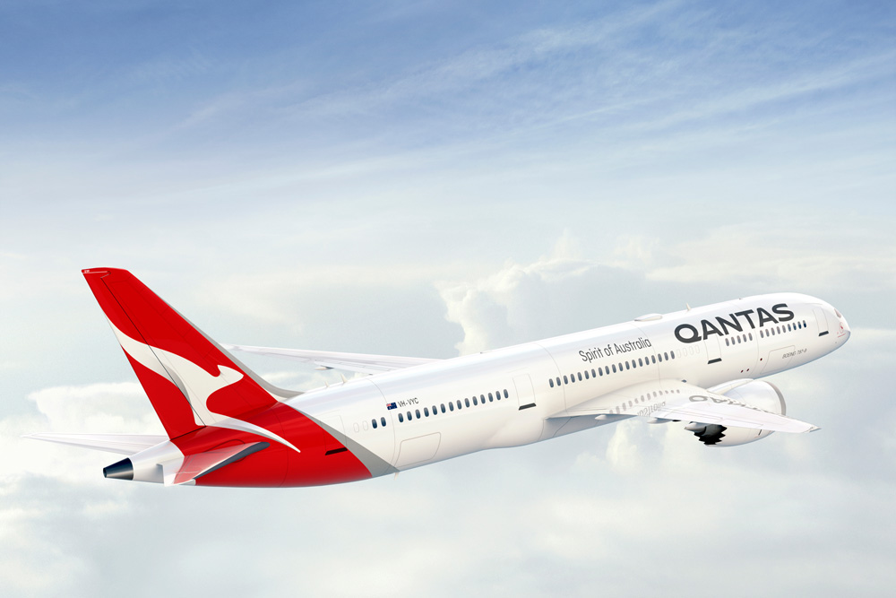
Australia’s largest airline has introduced a new logo and livery, designed in partnership with Quantas consultant Marc Newson and Australian branding agency Houston group.
In a press release, Quantas write:
The change is only the fifth time the red-and-white image on the tail of Qantas aircraft has been updated since it was first introduced in 1944. The last update was in 2007 to coincide with the introduction of the Airbus A380 to the national carrier’s fleet.

Marc Newson, who has helped design Qantas’ lounges, the A380 cabin and the iconic Skybed, said:
“Aircraft tails are fantastic canvas to work on and the Qantas logo is one of the most recognisable in the world. This re-design aims to retain the fundamental essence of the flying kangaroo but also move the brand forward.
“This new brand is more streamlined and the shading behind the kangaroo gives a better sense of movement and depth.
On the Houston Group Project Page:
The key opportunity for us was in contemporising the ‘roo. Making it more streamlined, and simplifying the shape. It’s evolved beyond a literal kangaroo - it’s become a unique brand symbol. We spent just as long handcrafting the Qantas logotype. We focussed on making it more streamlined, as if air is pushing across the top.


Comments
Post a Comment