Lukie's Farmhouse

I can clearly remember the first time that I ever tried authentic west country cider with strong cheddar cheese. I was with my father and it was from a place that he called Lukie’s, in the mendip region. On a recent trip back to the UK (I currently live in Cape Town), I could clearly see that Lukie’s no longer existed… that’s even if it was called Lukie’s in the first place as my dad seems remembers it as Luke’s, without the ‘i’.


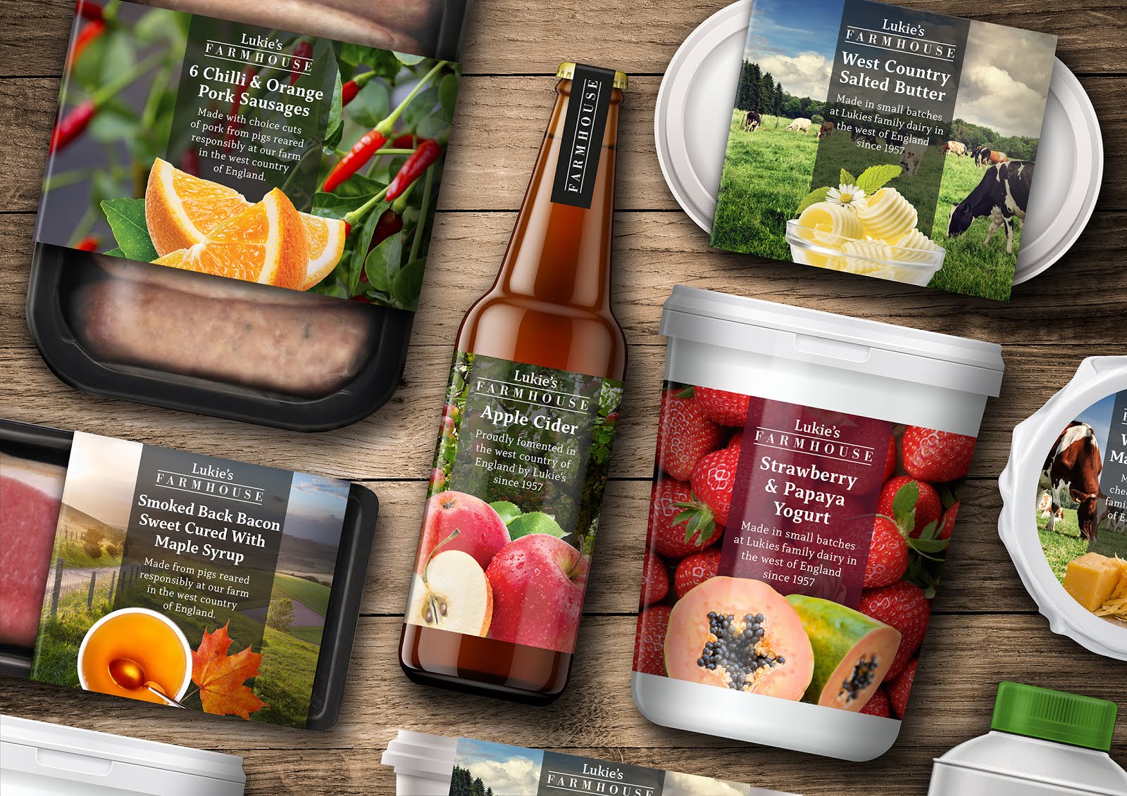
To conceive an idea for a range of food packaging and to breathe life back into the Lukie’s name as a brand, seemed like a great concept for a project and a lovely link back to my own personal past, being brought up close to the area in Bristol. My addition of the word Farmhouse helps to reinforce the ranges tone. A working title was also Homemade, but ultimately, I felt that Farmhouse just felt right for the range and worked so well visually in Bodoni, contained between two lines, with the Lukie’s word mark set in Capitolina above.
The Design of the Range
I entered into this self set brief really focusing on what the memory of Lukies really meant to me and what considerations I would make for the design if it was still around today. I wanted to use modern technologies with printing and packaging, yet being sympathetic of the company’s heritage through it's design.


The Lukie’s range needed to have a beautiful shelf appearance with large photographic elements and clear typography to navigate the consumer to each of the products. To accommodate the large and diverse product range including meat, dairy and beverages, I strived to create a clear visual identity system, using three distinct design elements that come together. Starting with a large image to either set the tone or as a secondary ingredient element, then the typography device backed with a colour tint for clarity and finally the image of the core ingredient or item.


My vision of a large product range but in small batches seemed like a perfect candidate for production using digital printing, ideal for low runs in CMYK with no set up costs.

Comments
Post a Comment