Posts

My last day at CTTC Design!

Image
I am sure that many of you already know that today is my last day with CTTC Design, before beginning an exciting new role in 2017, (more on this soon). When I left the UK for South Africa back in 2009, my brief was to help grow a fully operational design studio. It has taken a lot of blood, sweat and tears and I have loved every single second of it! I am so proud that today, not only have we achieved our objective, but I strongly believe that we have a world class design team with some of Cape Towns best packaging experts and many incredible business partners! After eight years of playing a role in the company’s incredible growth and six unforgettable years prior to that, at our UK partner 'Somerset Creative’, I am so honoured to have been part of this incredible journey and wanted to thank each and everyone of you, who has touched my life throughout this time! Thank you! Love and design... Do what you love and love what you do… Stay hungry and stay foolish... ------------------- B...
Taco Bell Logo Refresh

Image
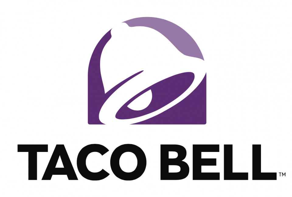
Many years ago, I travelled across the USA. It was an incredible experience that I will always cherish. Business has kept me traveling back and I have since designed branding and packaging for some of the countries largest retailers. One of my memories of my time traveling the US was the bright branding used by the many of fast food companies. Competition in the US was so much greater than that of the UK, where at the time I had travelled from. Now living in Cape Town many of the chains are starting to appear here. We recently saw the arrival of Dunk'in Donuts. I am not necessarily, someone that frequents fast food establishments, but the branding is of interest to me. I love how some are stooped in the history of 1950's America. I also love how they have subtly changed over the years. To read through some of my older posts, there are stories on the evolution of Burger King and Ihop. Taco Bell is another of the brands that I did not got to see, growing up in the UK. Back in 200...

Brand Masters Re-brand!

Image
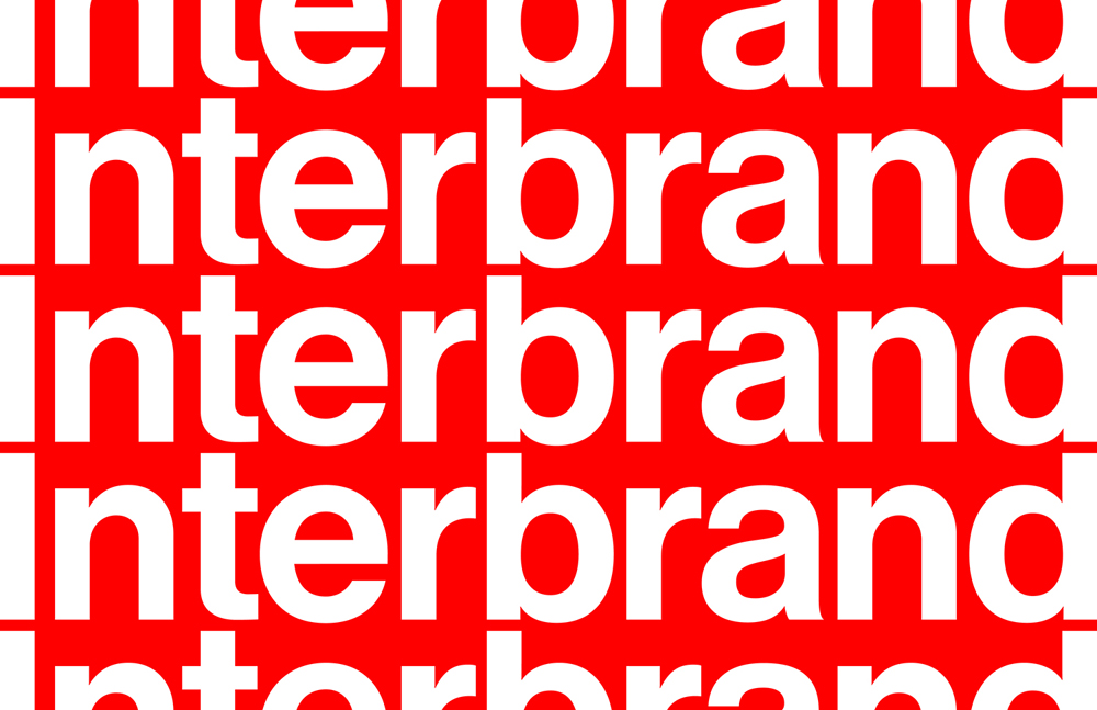
World renown branding agency Interbrand, have redesigned their famous word-mark, in-house. Moving the design into a clean but simple use of Helvetica, this supports their new look website. You can read more about interbrand below and can visit the site by clicking here . More here: Matthijs van Leeuwen project page Johnny Trinh (website) project page About Interbrand (from their website) At Interbrand, we believe that growth is achieved when an organization has a clear strategy and delivers exceptional customer experiences. We do both, through a combination of strategy, creativity, and technology that helps drive growth for our clients’ brands and businesses. With a network of 24 offices in 19 countries, Interbrand is a global brand agency, and publisher of the highly influential annual Best Global Brands and Breakthrough Brands reports, and Webby Award-winning brandchannel . Interbrand is part of the Omnicom Group Inc. (NYSE:OMC) network of agencies.

World Aids Day - Designing to End HIV

Image
On world AIDS day, I thought that it would be a good oportunity to give a huge shout-out to the amazing work that Vince Frost and studio Frost Collective are doing with ACON, to end HIV by 2020 in Australia. I love big ideas and they don't come much bigger than this. Please support the fantastic work that they are doing. Click here to read more at the Frost Collective Website . More here! Image: Frost Collective Image: Frost Collective

37 Great New Designers from Adobe Design Achievement Awards 2016

Image
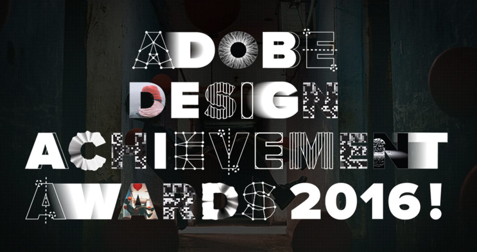
For the past five years I have had the great pleasure of being selected as a mentor for the ico-D and Adobe design Achievement Awards . This year however, I had the added bonus of also being chosen as a pre selection judge! I really enjoy what the awards stand for and it always feels so good to be able to support young design talent! Below are some of the fantastic young/student designers that I discovered, whilst judging the awards. There's some amazing talent here! If your hiring new creatives I would certainly urge you to view some of these talented young design stars of tomorrow and please support the ADAA! https://www.behance.net/ gallery/35944337/COP-25- United-Nations-Climate-Change- conference https://www.behance.net/ gallery/27135599/environment https://www.behance.net/ gallery/36153385/Sanfonzon- Street-pop-up-book https://www.behance.net/ gallery/33968594/Letter-for- Truth-Logo https://www.behance.net/ gallery/30570553/ Beruehrungsangst-fear-of- touching https://www.beh...

Design for Woolworth Longmarket Soap Shop

Image
A recent project that I had the great pleasure to work on with the brilliant Woolworths beauty team is getting some positive attention at the Woolworths Instagram page. This is the new oval tin that we have just introduced with a flat lid base, for the Longmarket Soap Shops Say “thank you for putting up with my kid all year” with these small but thoughtful gifts for Teachers. #linkinbio #findthemagic A photo posted by WOOLWORTHS SA (@woolworths_sa) on Nov 9, 2016 at 5:41am PST

Lukie's Farmhouse

Image
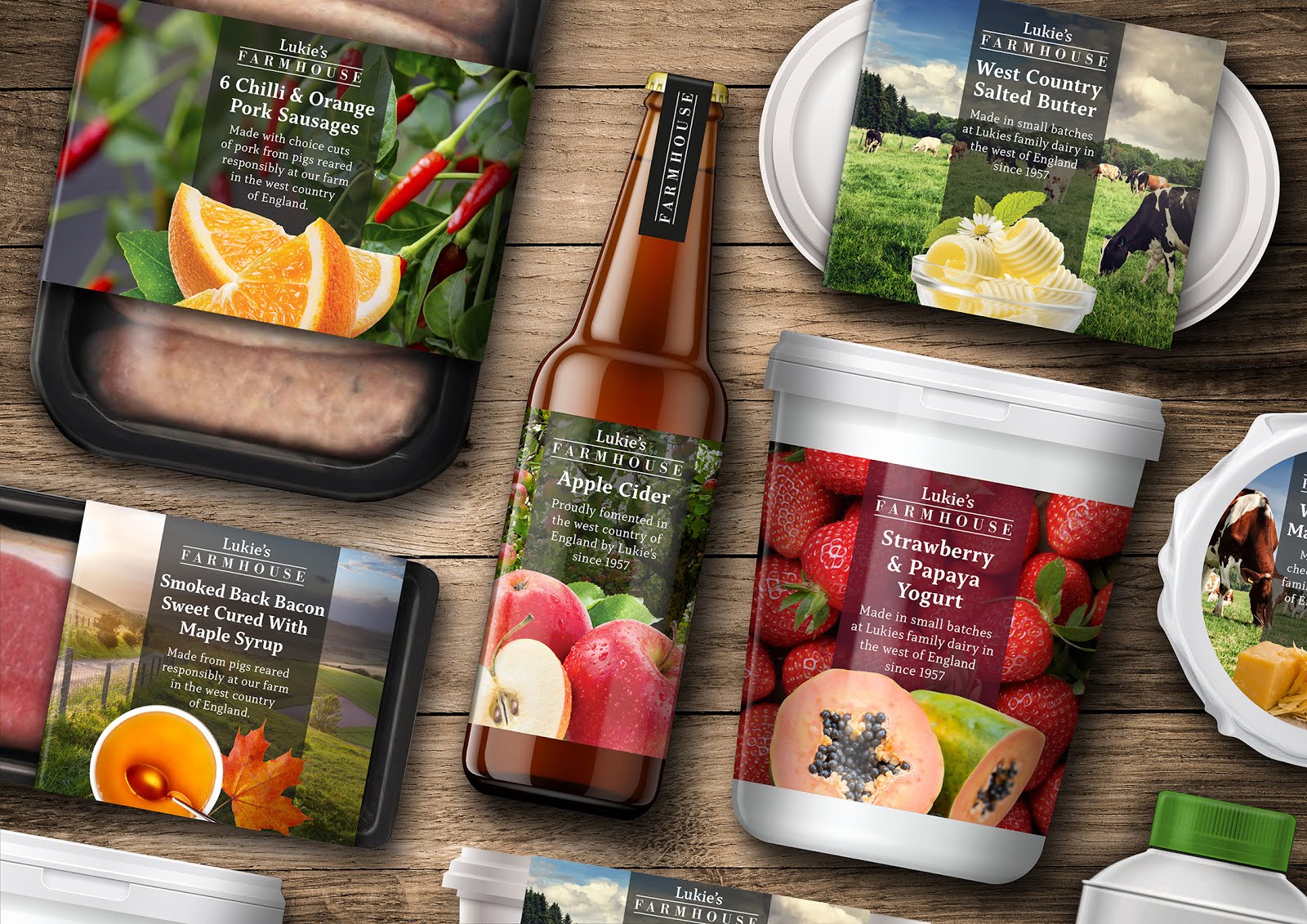
Lukie’s Farmhouse / The Story I can clearly remember the first time that I ever tried authentic west country cider with strong cheddar cheese. I was with my father and it was from a place that he called Lukie’s, in the mendip region. On a recent trip back to the UK (I currently live in Cape Town), I could clearly see that Lukie’s no longer existed… that’s even if it was called Lukie’s in the first place as my dad seems remembers it as Luke’s, without the ‘i’. A Link Back To My Past To conceive an idea for a range of food packaging and to breathe life back into the Lukie’s name as a brand, seemed like a great concept for a project and a lovely link back to my own personal past, being brought up close to the area in Bristol. My addition of the word Farmhouse helps to reinforce the ranges tone. A working title was also Homemade, but ultimately, I felt that Farmhouse just felt right for the range and worked so well visually in Bodoni, contained between two lines, with the Lukie’s word mar...