Posts

New Logo For MasterCard Designed By Pentagram

Image
The new logo for Mastercard, designed by Pentagram, has been raising eyebrows online and seems to be dividing the design industry on whether people are in favour or not. I for one am a huge fan of the new design! I love how Pentagram have looked back at the heritage of the logo and brought back original elements, yet balanced it perfectly to create a brand-mark that is ultimately very modern and uncluttered. This is most evident within the choice of a clean and modern type style that has been employed, all in lower case and now moved below the symbol for the first time. This logo is a success for me in the same way that the updated Google logo was last year. Great branding is about creating a simple iconic message. Look at Apple, Nike or what the red cross means to us all. These are forms at their simplest that instantly connect with us and this is why the pared down and modenised re-working is so successful for me. What are your thoughts on the revised, paired down design? Below is th...

Sainsbury's Design Studio 1962-1977

Image
I am an avid collector of design books and on a recent trip back to the UK, I stumbled across a fantastic book containing a veritable gold mine of vintage Sainsbury’s packaging, chronicling the years 1962 to 1977. The books forward tells the story of the author, Jonny Trunk and his search for a particular 1970 Sainsbury’s pack design for cornflakes that he had memories of from his childhood. On calling the retailers head office, he discovers that there’s a huge archive of pristine Sainsbury’s own label packaging dating back from the 1960’s and onwards. An ideal subject for a book! There is also an essay from Emily King, which gives an insight into the relationship between the company director, forward thinking JD Sainsbury and the visionary designer Peter Dixon who founded the Sainsbury’s in house creative studio and spearheaded it’s unique pack designs.       Also of note is the important role that the company played in society. Britain was going through a period of soci...

Brexit: Business Leaders Reaction to Result

Image
On Friday 24th of June 2016, Britain woke to the realisation that the majority (52%) had voted to leave the EU. The shock waves that followed have dominated the news. David Cameron has made the decision to step down as Prime Minister and the pound is currently at a 31-year low, making England poorer than France. The FTSE 100 has dropped 8.7pc and ratings agency S&P have downgraded UK's credit rating from AAA to AA, due to the negative outlook after the Brexit vote. Labour's shadow cabinet members are also quitting in response to Jeremy Corbyn's leadership over the EU referendum! Analyst are predicting that many investors are likely to move their money out of the UK and for the people of Great Britain it may mean that European travel and imported products could well rise in cost. In addition Scotland has voted to remain and many of it’s population would sooner break away from the UK instead of leaving the EU. Britain as a whole is divided. For many the country is in turm...

The Most Important Word You Use Is Why

Image
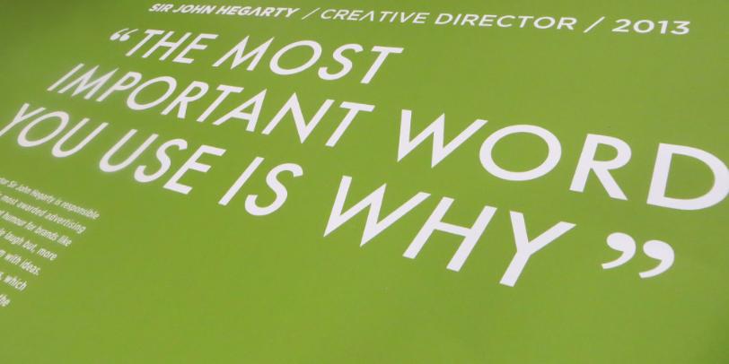
"The most important word you use is why!"  That’s was what Sir John Hegarty told the crowd at an inspiring presentation that I was lucky enough to attend back in 2013. In my role as creative director, I get to brief in the design team. It's important to ensure that everything that goes through the studio is the best it can be. I have to mentor and up skill young designers and I always love to watch how they respond to briefs. Many designers sketch out ideas, others go straight to their computers. Without a doubt, Google is one of the most incredible inventions of our time, yet still, one of my pet hates are designers going straight to Google without an idea. I've been known to not let designers on a computer until I first see an idea. I want designers to have that moment of discovery and to have the ability to ask why. Recently one of my team was struggling with a project. I could see it in her face... The fear... And on her computer... Google!!! After a brief discu...

My Copy of Graphis Diagrams

Image
In 1974 Walter Herdeg edited issue 165 of Graphis Diagrams, a square hardback book showing the scientific side of graphic design. It contains beautifully illustrated, full colour diagrams of abstract data and theres also some lovely multi layered maps that use transparent papers. The cover is a fantastic example of the modernist Swiss style of type and design. It really is a thing of beauty, an iconic classic and I once had a copy, or should I say, I may still have a copy... Somewhere! It wasn't that I forgot I had it, but instead that I was recently reminded when I turned to page 46 of Steven Heller and Veronique Vienne's fantastic book '100 Ideas That Changed Graphic Design', and there it was in all it's glory, featuring in the chapter 'The Square Format! I am not completely sure of how this book came into my life. My father was always great at picking up a bargain and may of bought it second hand for his son. My family always supported my love of everything c...

Bass - Trademark No1

Image
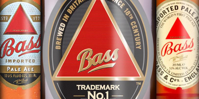
In my Classic Brands series, I am going to feature interesting facts and a brief history to some of the world most iconic branding and packaging designs. I couldn't think of a better place to begin the series than with the worlds very first registered Trade Mark. A great conversational piece at any dinner party is the question, ‘what was the world’s first brand identity?’ The answer is the instantly identifiable red-triangle of the Bass Pale Ale logo. This distinctive identity was registered under the United Kingdoms 1875 Trade Mark act. Due to the fact that the act actually came into effect on 1st January 1876, an employee of Bass queued outside the registrar's office for the whole of the New Years Eve night to ensure that they were the very first in line to register the trademark the following day. Thanks to the efforts of that Bass employee, Ratcliff & Gretton Ltd received the first two registrations, the Bass Red Triangle for their pale ale and the Bass Red Diamond for ...

My Design Life

Image
In a recent interview for a design magazine I was asked, " who and what inspires me ". It's a question that I am often asked and my initial reply is usually "everything", from my family (my wife and son are without a doubt my biggest inspiration) to the great icons of our industry such as Paul Rand and Soul Bass to the the work of Henryk Thomaszewski, Jan Lenica and Henri Matisse (the list could go on and on and on…) I wake up inspired almost every morning and by the time I am in my studio, or out with my family on the weekend, I have often seen something to trigger creativity. It really does come from everywhere, from a texture, a colour, a conversation, a story to something quirky! In Iconoclasts Season 6, Episode 5, Paul Smith tells how he was once walking down a street with an advertising exec. The marketing person says that he sees about three things whilst Smith sees around Fifty! I am a huge fan of designer Michael Wollf and his thoughts on what he descri...