Posts

Showing posts from November, 2016

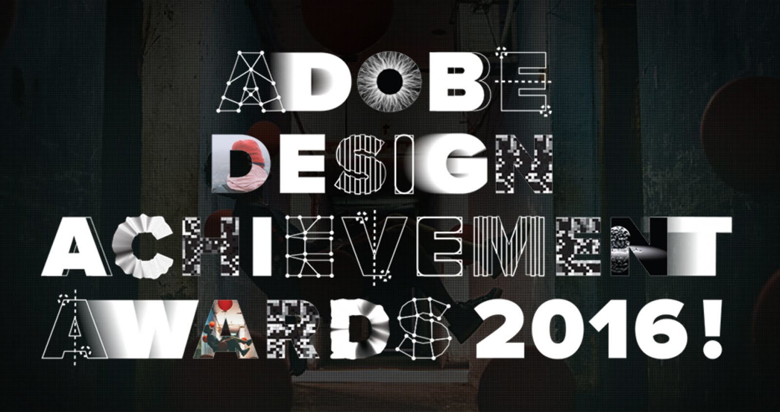
37 Great New Designers from Adobe Design Achievement Awards 2016
Image
For the past five years I have had the great pleasure of being selected as a mentor for the ico-D and Adobe design Achievement Awards . This year however, I had the added bonus of also being chosen as a pre selection judge! I really enjoy what the awards stand for and it always feels so good to be able to support young design talent! Below are some of the fantastic young/student designers that I discovered, whilst judging the awards. There's some amazing talent here! If your hiring new creatives I would certainly urge you to view some of these talented young design stars of tomorrow and please support the ADAA! https://www.behance.net/ gallery/35944337/COP-25- United-Nations-Climate-Change- conference https://www.behance.net/ gallery/27135599/environment https://www.behance.net/ gallery/36153385/Sanfonzon- Street-pop-up-book https://www.behance.net/ gallery/33968594/Letter-for- Truth-Logo https://www.behance.net/ gallery/30570553/ Beruehrungsangst-fear-of- touching https://www.beh

Design for Woolworth Longmarket Soap Shop

Image
A recent project that I had the great pleasure to work on with the brilliant Woolworths beauty team is getting some positive attention at the Woolworths Instagram page. This is the new oval tin that we have just introduced with a flat lid base, for the Longmarket Soap Shops Say “thank you for putting up with my kid all year” with these small but thoughtful gifts for Teachers. #linkinbio #findthemagic A photo posted by WOOLWORTHS SA (@woolworths_sa) on Nov 9, 2016 at 5:41am PST

Lukie's Farmhouse

Image
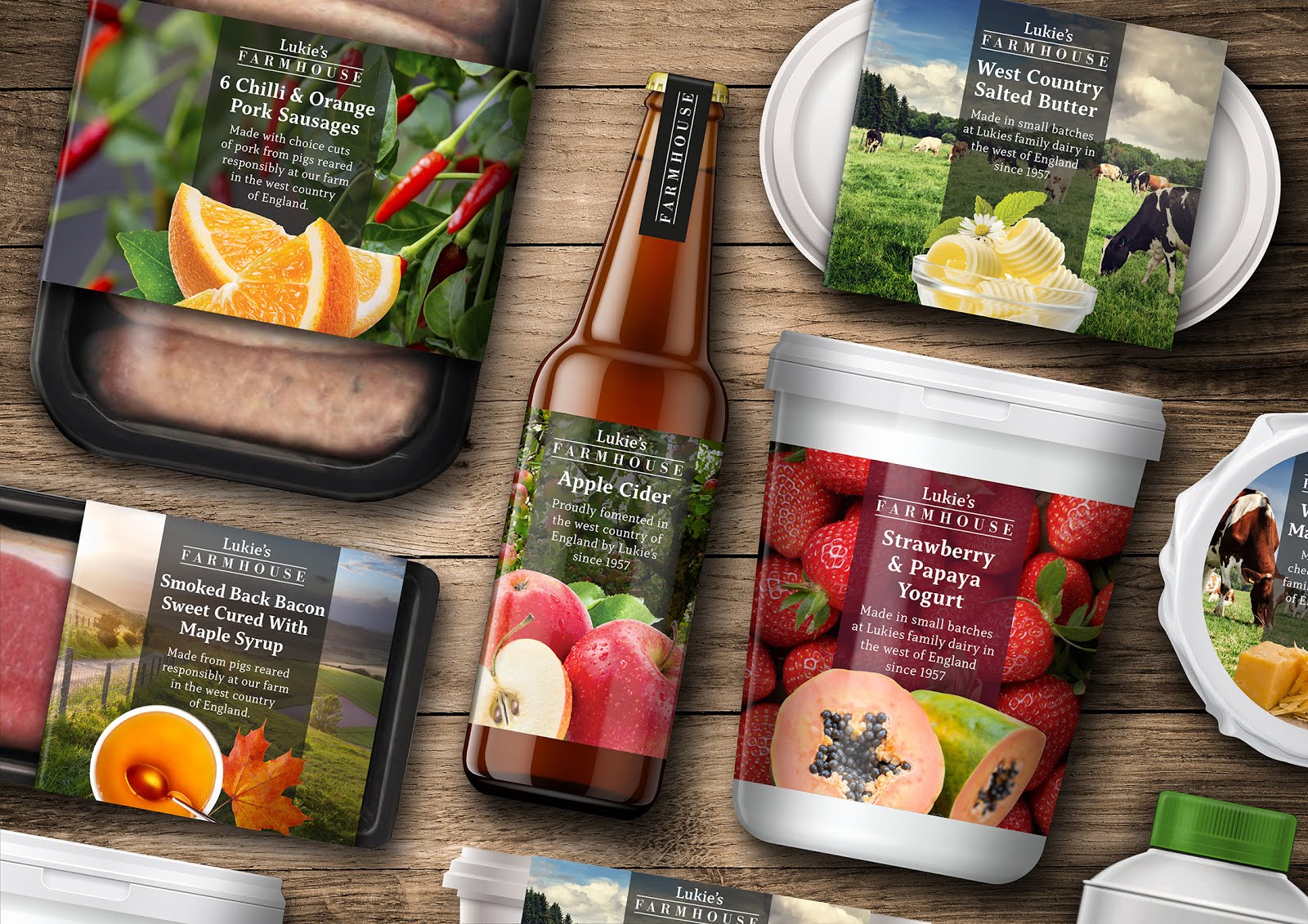
Lukie’s Farmhouse / The Story I can clearly remember the first time that I ever tried authentic west country cider with strong cheddar cheese. I was with my father and it was from a place that he called Lukie’s, in the mendip region. On a recent trip back to the UK (I currently live in Cape Town), I could clearly see that Lukie’s no longer existed… that’s even if it was called Lukie’s in the first place as my dad seems remembers it as Luke’s, without the ‘i’. A Link Back To My Past To conceive an idea for a range of food packaging and to breathe life back into the Lukie’s name as a brand, seemed like a great concept for a project and a lovely link back to my own personal past, being brought up close to the area in Bristol. My addition of the word Farmhouse helps to reinforce the ranges tone. A working title was also Homemade, but ultimately, I felt that Farmhouse just felt right for the range and worked so well visually in Bodoni, contained between two lines, with the Lukie’s word mar

David Carson - All For a Few Good Waves

David Carson is arguably one of the worlds most recognised graphic designers. his experimental, deconstructed typographic style is a fusion of the commercial and the expressive, graphic design and art. From 1982 to 1987, Carson worked as a teacher and also at that time was also a professional surfer, reaching 9th in the world ranking. Carson himself often attributes his recognisable style to discovering graphic design and never being taught it. Without knowing any of the rules has allowed him the freedom to not be confined by convention. To read more on Carson click link to visit his website: David Carson Design . I also love his humour filed, motivating TED presentation. Click here to view. Quotes by David Carson: “Graphic design will save the world right after rock and roll does.” “I’ve never had a problem with a dumb client. There is no such thing as a bad client. Part of our job is to do good work and get the client to accept it.” —————————————————————————— All For a Few Good Wave

Quantas Brand Update

Image
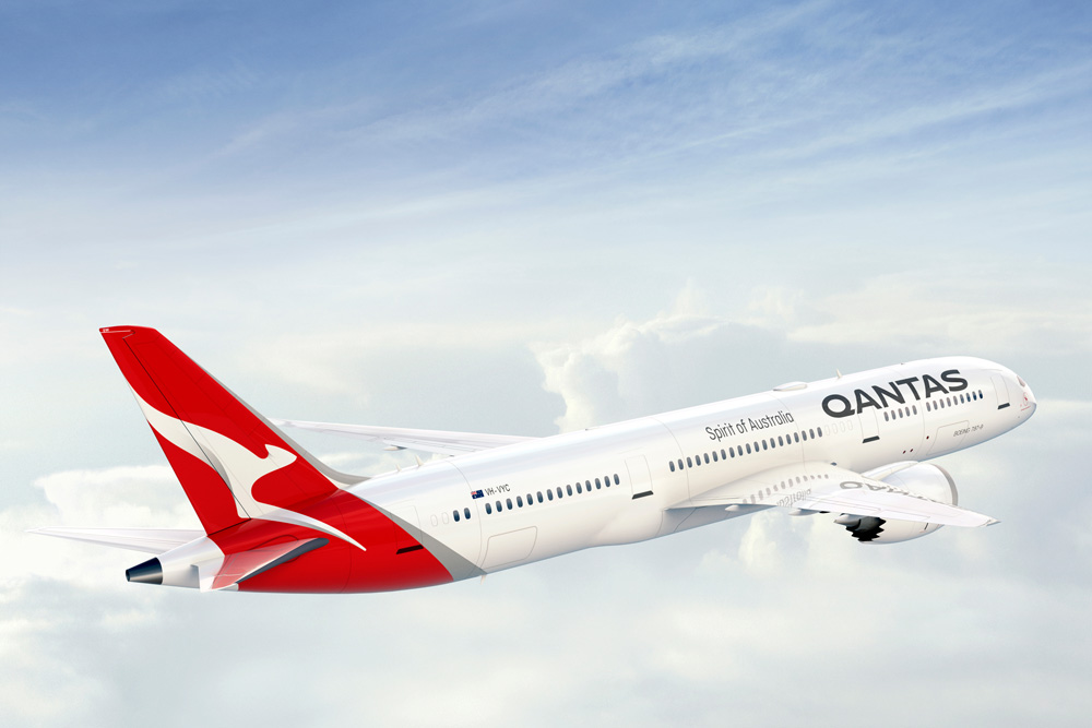
Australia’s largest airline has introduced a new logo and livery, designed in partnership with Quantas consultant Marc Newson and Australian branding agency Houston group. In a press release, Quantas write: The change is only the fifth time the red-and-white image on the tail of Qantas aircraft has been updated since it was first introduced in 1944. The last update was in 2007 to coincide with the introduction of the Airbus A380 to the national carrier’s fleet. Marc Newson, who has helped design Qantas’ lounges, the A380 cabin and the iconic Skybed, said: “Aircraft tails are fantastic canvas to work on and the Qantas logo is one of the most recognisable in the world. This re-design aims to retain the fundamental essence of the flying kangaroo but also move the brand forward. “This new brand is more streamlined and the shading behind the kangaroo gives a better sense of movement and depth.   On the Houston Group Project Page: The key opportunity for us was in contemporising the ‘roo. Ma