Posts

Showing posts from July, 2015

My New Design Life

Image
If your a reader of this blog, then you will know that I'm both a dad to a one year old and also the creative director of a design studio. As you can imagine, I don't get too much downtime and only get to write in a very small window, often late at night and on the weekend. My family, then my commercial design work always take priority in my life and it's become more evident to me that I'm getting less time for my hobbies such as writing my blog. I'm cool with it! I love being a family man and I'm passionate about my work. To this end, I've decided to make a couple of changes. Firstly you may have noticed that the design life site has switched to a more classic blog style. This means that the blog is now a little more focused on writing as content over the visual form. You may also notice a lot of posts over three days in July of 2015. That's simply because I ported two years worth of posts in bulk to the new blog. I thought it would be good to keep ever

Why Pink & Blue?

Image
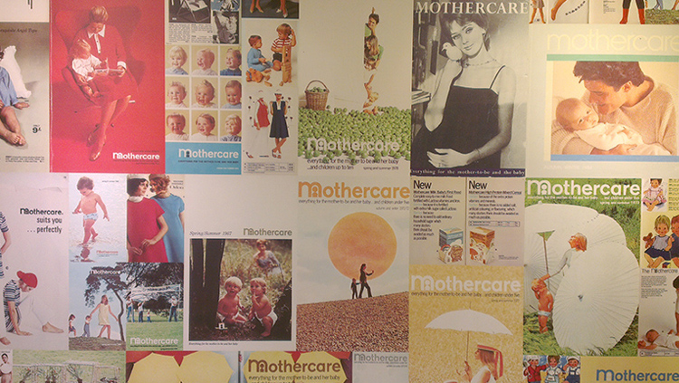
I recently became a dad to a wonderful, amazing little boy and he is definitely the most loved new addition to my design life. Whilst my wife was still pregnant, we decided that we did not want to know the babies sex before the birth and loved the idea of it being a surprise. This however was met with some shock and surprise from a good many of our friends who just couldn't believe that we wouldn't want to know this in advance. How could we possibly prepare if we didn't know what colour to decorate the babies room or buy them clothes? I suddenly started to ask myself why! Who decided that pink was a feminine colour and blue masculine. The marketeers? The branding experts? More so, why is there actually a need for a gender based distinction? At this point my curiosity kicked in and I suddenly wanted some answers. After some research, I found images of babies clothing from the 18th century, showing both girls and boys in white frilly dress style outfits. Many articles claim t

Colour Wars

Image
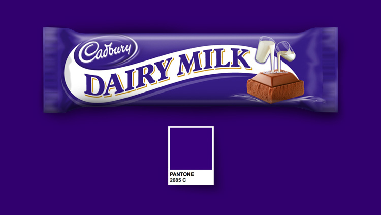
Is it acceptable for a brand to trademark a colour?Colour plays such an essential role in the identity of a brand. Think of the blue used in the Facebook logo, Caterpillars yellow or Home Depots orange. Then there's Coca Cola's red that's such a strong identity that it even managed to change the colour of Santa clause! But with this in mind, should these company's be allowed to own that specific colour? The confectionary company Cadbury lost a five year court battle to register their distinctive shade of purple, Pantone 2685C. The company stated that they had been using the colour on their Dairy Milk bars since the first world war. Lawyers for rival company Nestlé, who use a similar colour on their quality street packaging, overturned a previous judgment that prevented other manufacturers from using the colour. In closing the judges claimed that the colour alone did not constitute as the trademark but instead only played a part with other elements. The mobile phone prov

Lets talk about design!

Image
Welcome to my new blog! I have created it as a place to encourage topical discussion on creativity and innovation, celebrating both the beauty and success of the finished product, but also the journey and the processes involved along the way. I want us to talk about inspiration, ideas and where they come from, taking risks, failing and succeeding. We wont be taking anything for granted. I'm going to be asking why a lot. There will be design resources, including some great books and blogs to read, guides on fonts and packaging design, information on some of the worlds best design agencies and step by step insights into real world product development. There will be regular feature's on vintage type, branding and packaging. This will include a vast collection of images collected over many years, often accompanied by an historical look into the way these brands have developed throughout their lifespan. I also wanted to include a section on designing for good. Throughout the World,