Sainsbury's Design Studio 1962-1977

The books forward tells the story of the author, Jonny Trunk and his search for a particular 1970 Sainsbury’s pack design for cornflakes that he had memories of from his childhood. On calling the retailers head office, he discovers that there’s a huge archive of pristine Sainsbury’s own label packaging dating back from the 1960’s and onwards. An ideal subject for a book!
There is also an essay from Emily King, which gives an insight into the relationship between the company director, forward thinking JD Sainsbury and the visionary designer Peter Dixon who founded the Sainsbury’s in house creative studio and spearheaded it’s unique pack designs.


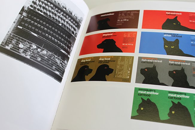

Also of note is the important role that the company played in society. Britain was going through a period of social change in the 1960’s/70’s and the supermarket evolved with its costumers. This including working mothers who strived for quick, convenient meals to fit with their busy lives and those who had just taken their first foreign holidays and wanted more exotic ingredients. Although my family didn’t travel overseas whilst I was growing up (our holidays were in North Devon), I can still fondly remember the introduction from meat and two veg, to Indian curries and Italian spaghetti bolognese. With its use of san serif typography, bold colour and form, the packaging design represented modernity within this time of great social and economic change.
Being born in Britain in the early seventies, I had huge waves of nostalgia looking through the pages and remembering some of the distinctive designs. These works really did become the fabric of daily life in Britain. The design for the coke tin, using the company logo on a slant to represent a straw would never get through the rigid rules and guidelines set out by the brand experts of today, but somehow gives so much character and identity to the design. These days, some may see naivety from a time gone by, yet others (like me) will appreciate its concept! JD Sainsbury wasn’t always keen on the slanting of the company logo but this further emphasises the full backing that he gave to designer Peter Dixon. The book also recalls how teachers would cut out the orange discs from the cornflakes packs to represent coins whilst teaching school children about money!
Being born in Britain in the early seventies, I had huge waves of nostalgia looking through the pages and remembering some of the distinctive designs. These works really did become the fabric of daily life in Britain. The design for the coke tin, using the company logo on a slant to represent a straw would never get through the rigid rules and guidelines set out by the brand experts of today, but somehow gives so much character and identity to the design. These days, some may see naivety from a time gone by, yet others (like me) will appreciate its concept! JD Sainsbury wasn’t always keen on the slanting of the company logo but this further emphasises the full backing that he gave to designer Peter Dixon. The book also recalls how teachers would cut out the orange discs from the cornflakes packs to represent coins whilst teaching school children about money!


This gem of a book currently sits in pride of place at my design studio. After being based in Cape Town for over half a decade it feels like a fantastic snap shot of design and of a changing society in a country and time for which I was born and raised. A time long before the invention of the Apple Mac and Adobe software it shows how concept rules over tools and technology! I can’t recommend this book enough.
The book is written by Jonny Trunk and published by Fuel: www.fuel-design.com
Article originally published by Todd Anderson at The Design Life

Comments
Post a Comment