3 High Profile Tech Giants Rebrand
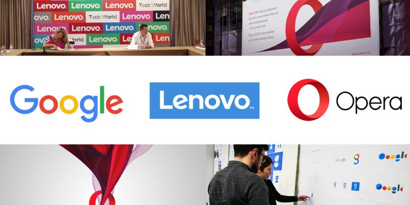
Over the past months we have seen some very high profile brand redesigns within the tech sector, including the likes off Google, Opera and Lenovo. To this end, I thought that it would be interesting to take a brief look behind the scenes at some of the agencies, processes and rationales that have been employed within each of the three projects.
Visually, this new approach delivers on a fresh modern feel but there’s so many more reasons why this new brand mark improves the Google experience for me. The obvious advantages of changing to the new san serif face are clear when you consider how the brand is often viewed on small devices such cell phones.
Below are the four key areas that Google outlined for their redesign strategy, taken from the Google's design case study featured at Brand New:
1. A scalable mark that could convey the feeling of the full logotype in constrained spaces.
2. The incorporation of dynamic, intelligent motion that responded to users at all stages of an interaction.
3. A systematic approach to branding in our products to provide consistency in people’s daily encounters with Google.
4. A refinement of what makes us Googley, combining the best of the brand our users know and love with thoughtful consideration for how their needs are changing.
There are three distinct elements to the new Google branding. One is the new san serif Google Logotype but theres also the Google G and then four dots all employing the distinct colour palette. Below are some of Googles rational for the three elements, from the Google design case study:
Google Logotype
"The Google logo has always had a simple, friendly, and approachable style. We wanted to retain these qualities by combining the mathematical purity of geometric forms with the childlike simplicity of schoolbook letter printing. Our new logotype is set in a custom, geometric sans-serif typeface and maintains the multi-colored playfulness and rotated ‘e’ of our previous mark—a reminder that we’ll always be a bit unconventional.
Google G
The Google G is directly derived from the logotype ‘G,’ but uses increased visual weight to stand up at small sizes and contexts where it needs to share space with other elements. Designed on the same grid as our product iconography, the circular shape was optically refined to prevent a visual “overbite” at the point where the circular form meets the crossbar. The color proportions convey the full spectrum of the logotype and are sequenced to aid eye movement around the letterform.
Google Dots
The Google dots are a dynamic and perpetually moving state of the logo. They represent Google’s intelligence at work and indicate when Google is working for you. We consider these unique, magic moments. A full range of expressions were developed including listening, thinking, replying, incomprehension, and confirmation. While their movements might seem spontaneous, their motion is rooted in consistent paths and timing, with the dots moving along geometric arcs and following a standard set of snappy easing curves.


Opera
Opera Software ASA released version one of the Opera web browser back in 1995 in Oslo, Norway. The company now has over 350 million users worldwide on both desktop and mobile platforms. The new visual identity was the collaboration of the in-house team at Opera and design firm Anti. Global brand and creative strategy was undertaken by the London based studio DixonBaxi. I am a real fan of the brand move on. I love the identity created by the 3D elements, which balance beautifully with the simple san serif word mark, creating a wonderful modern and forward focused vision.


Lenovo
The Lenovo group are a serious contender in the technology marketplace. They design, manufacture and sell personal computers, tablets, smartphones and servers. The company dates back to 1984 and was originally named Legend. They have headquarters in both Beijing China and Morrisville North Carolina and 2014 were the worlds largest purveyor of personal computers with their ThinkPad flagship range of PC and laptops.Their new logo has been designed by Saatchi & Saatchi New York and as with both Opera and Google's redesign has a clean modern feel. The word mark is now incased within a colour bar, that is meant to represent a window that can be used in a pallete of six different colours. Theres even a turn to the 'e'… now where I have seen that! Oh that was Google earlier!!!
In a Blog post from Lenovo the company describe the new look: The cornerstone of our new identity is our new logo — a mark that is made up of two key elements. First, there’s the word Lenovo, which we’ve designed in a more contemporary way, making it more readable so there are no pronunciation issues around the world. More importantly, this wordmark is housed in a containing shape, which is meant to be more than just a design element. It acts as a window into culture and the world that surrounds us, housing a range of images, colors and patterns.


Comments
Post a Comment